COROS AI · Case Study
COROS AI Redesign: MUI → shadcn
AI life coaching app. I rebuilt the entire product UI and its design system, live on web, iOS, and Android.
- Role
- Product Designer
- Ownership
- Design system owner
- Platforms
- 4 platforms: web, tablet, iOS, Android
- Links
- app.coros.ai · Figma
The product
COROS AI: an AI life coach that helps you navigate relationships and communication.
It is a B2C AI-native coaching platform with a chat-based interface, where people have long, ongoing conversations by text and voice. I joined as the founding product designer, and my work has spanned product design, UX, prompt engineering, user research, and brand.
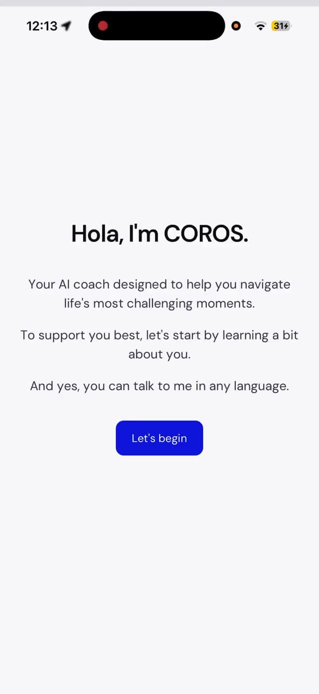
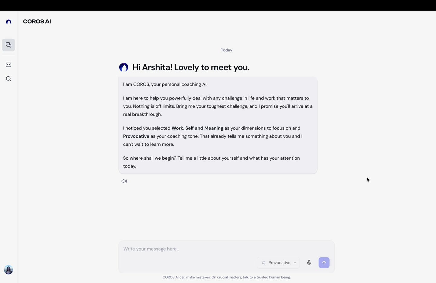
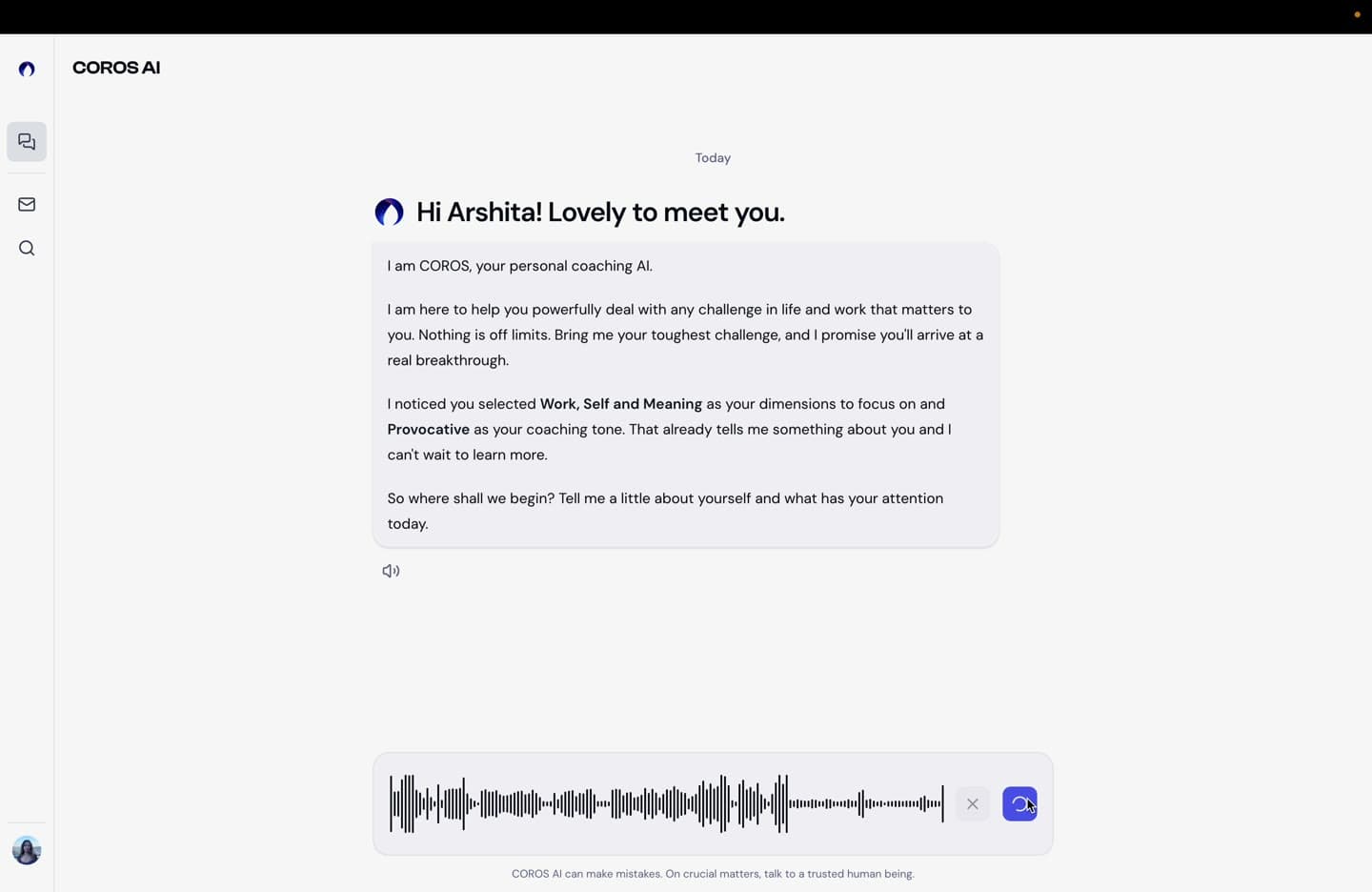
The live product, in light and dark
At a glance
54+
semantic tokens, light and dark
Days → hours
design-to-review cycles
4
platforms: web, tablet, iOS, Android
Context
The problem
Testers said the v1 product strained their eyes. Engineering was moving to shadcn, and I owned the design side of the migration.
Foundation
Design system
One rule: components never touch raw colors. Everything resolves through primitives → brand layer → semantic tokens, mirroring the code exactly.
Raw primitives → Brand layer → Semantic tokens → Components
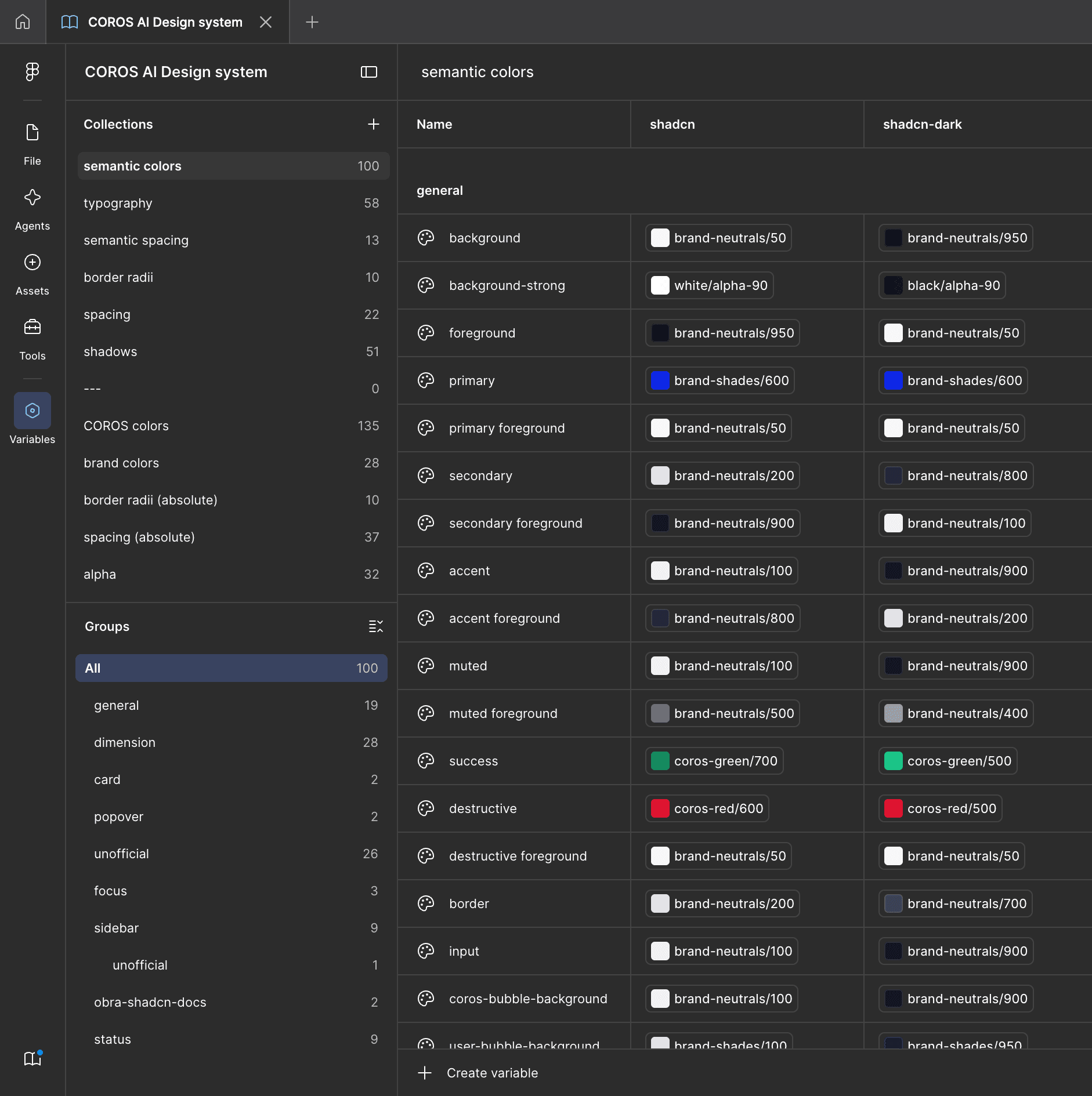
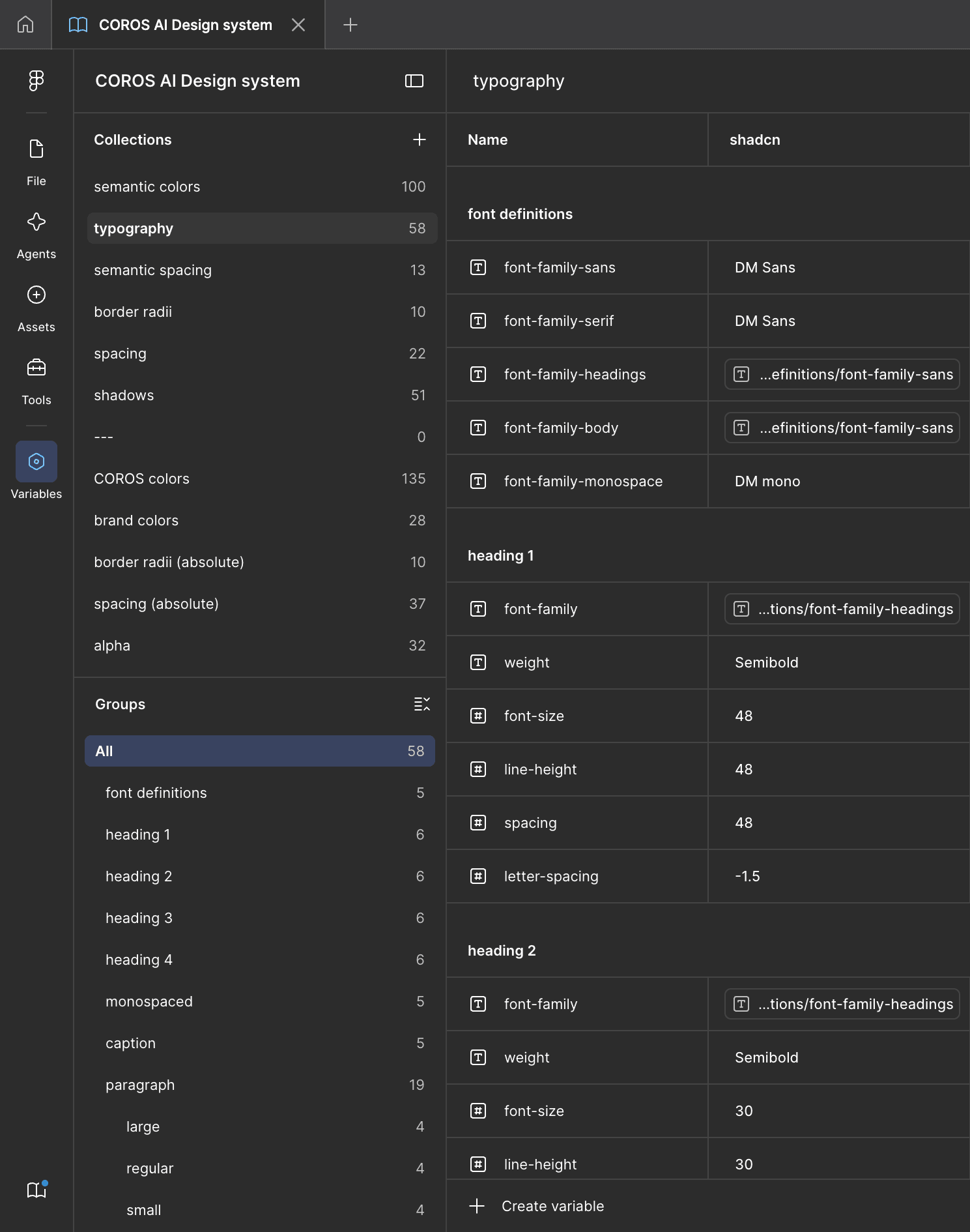
The system in Figma: semantic colors holding a value per token for both light and dark modes, and typography resolving through shared font definitions.
- Custom 11-stop scales for COROS blue, orange, and blue-tinted neutrals.
- 54+ tokens across light and dark via Figma variable modes: design once, toggle themes with one click.
- Published as a shared library; the whole team builds on it without detaching.
Architecture
Components
Variants only when structure changes. Everything else is a property. The chat input handles 4 states × all breakpoints without a variant explosion.
Screens
Onboarding
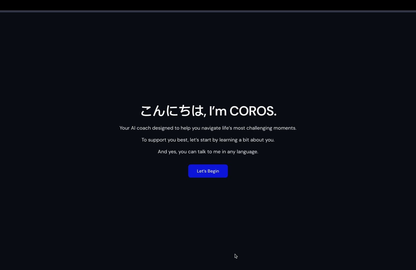
8 dark-only screens → 6 themed screens, name moved up front so the flow addresses you personally.
The tone screen teaches by interaction: pick Supportive or Provocative and the orb, card, and background respond.
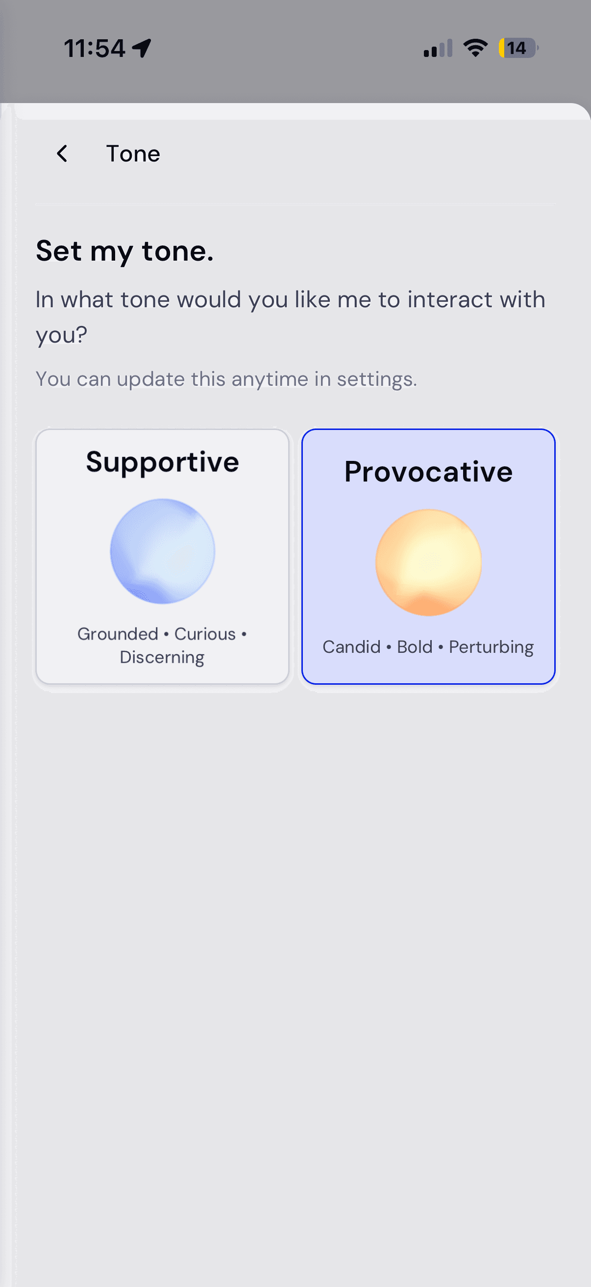
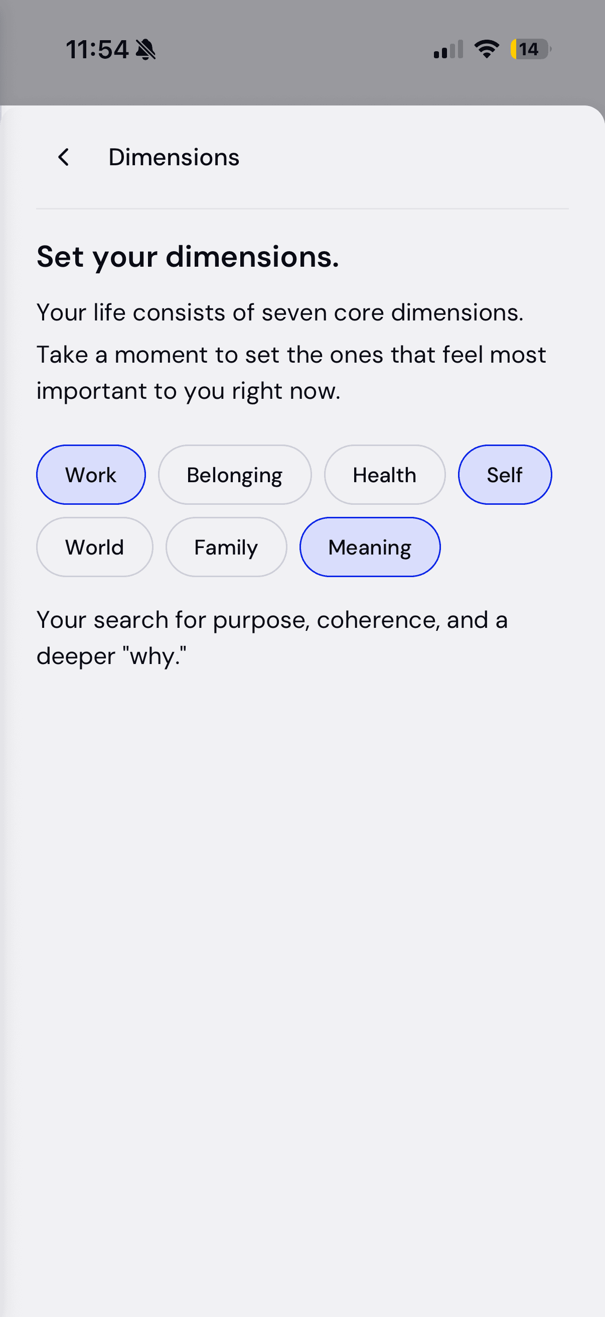
The same flow on mobile (light theme): the multilingual welcome, the tone cards with their orbs, and the dimension pills. Every screen was designed for web, tablet, iOS, and Android at once.
Screens
Chat
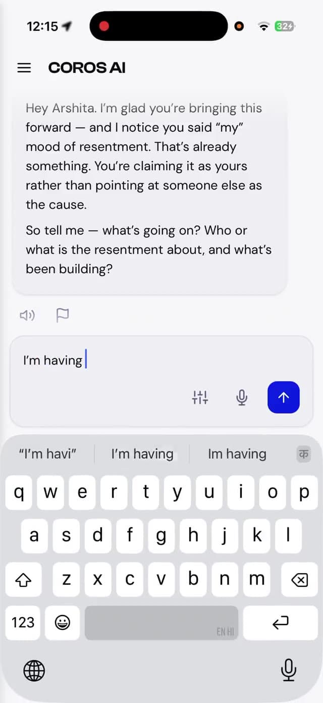
Designed the full state inventory: empty, streaming, errors, message actions, return-to-chat. Prototyped 3 user-bubble options in working HTML to settle the debate.
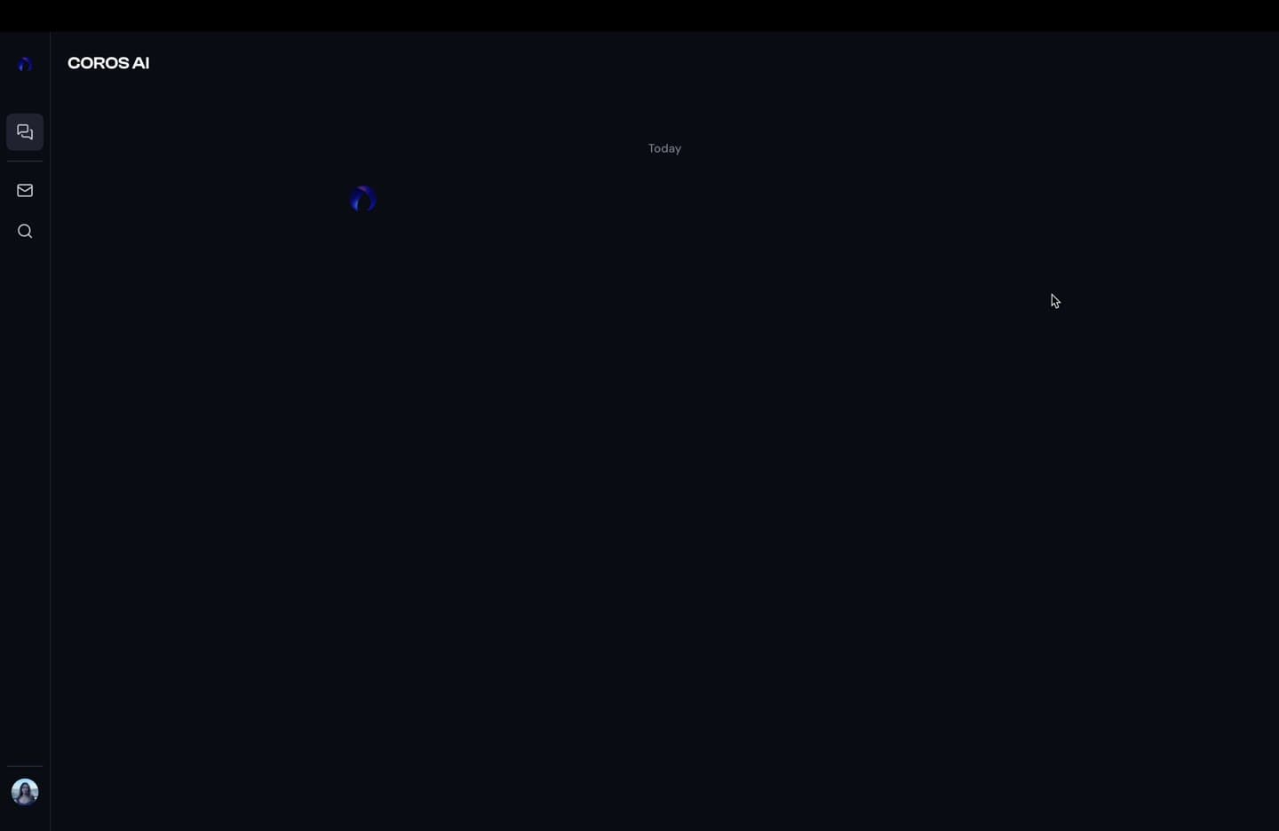
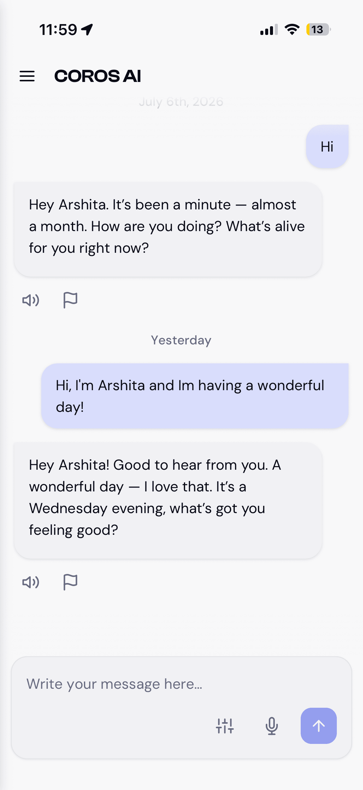
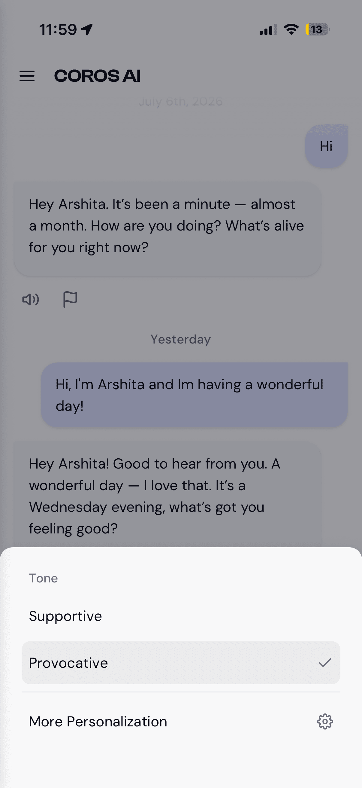
The same surface on mobile (light theme): date-grouped history with message actions, the inline tone quick-switch, and composing a message. One component system, both themes.
Every state a conversation can be in
Chat is the product, so the states got inventoried before any screen was drawn. Most of them are waiting or failure states, not the happy path: empty, streaming, errors, message actions, return-to-chat.
| State | What triggers it | What the user sees |
|---|---|---|
| Empty state | Triggered byA new conversation with no messages yet. | User seesThe greeting and the composer, with nothing above it. |
| Typing indicator | Triggered byThe message has been sent and the model has not begun responding. | User seesAn indicator in place of the response, so the wait is accounted for. |
| Streaming text | Triggered byThe response has started arriving. | User seesText building in the response bubble, distinct from the typing state. |
| Message-level actions | Triggered byA COROS response has completed. | User seesRead-aloud and flag actions beneath the message. |
| Error and retry | Triggered byThe response fails. | User seesThe failure surfaced in place, with a retry available. |
| Scrolled away mid-response | Triggered byThe user scrolls up while a response is arriving. | User seesA return-to-chat affordance rather than a forced scroll jump. |
Screens
Settings
Modal shell with persistent nav. Appearance toggle moved into the sidebar so switching themes never requires navigating.
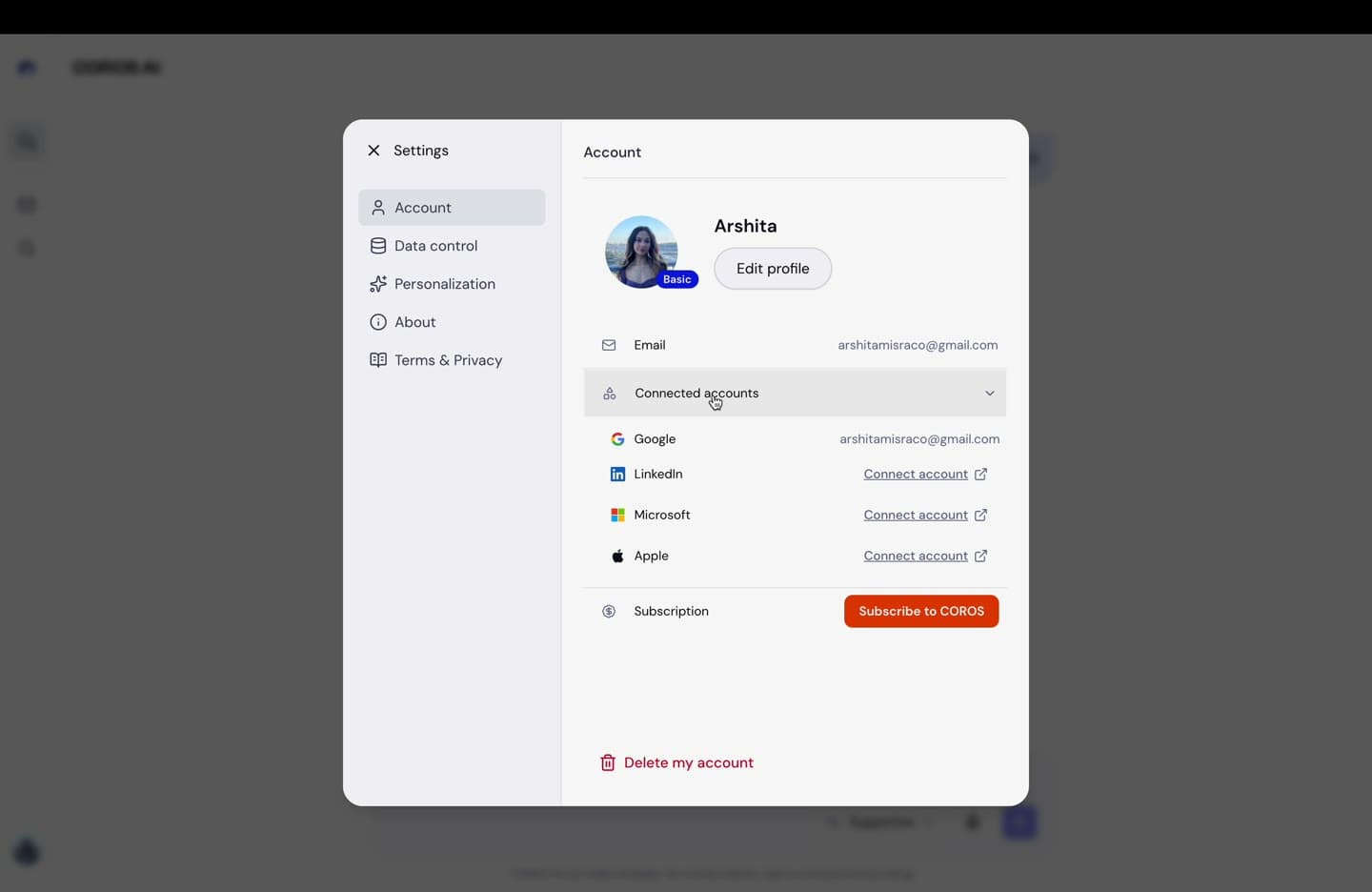
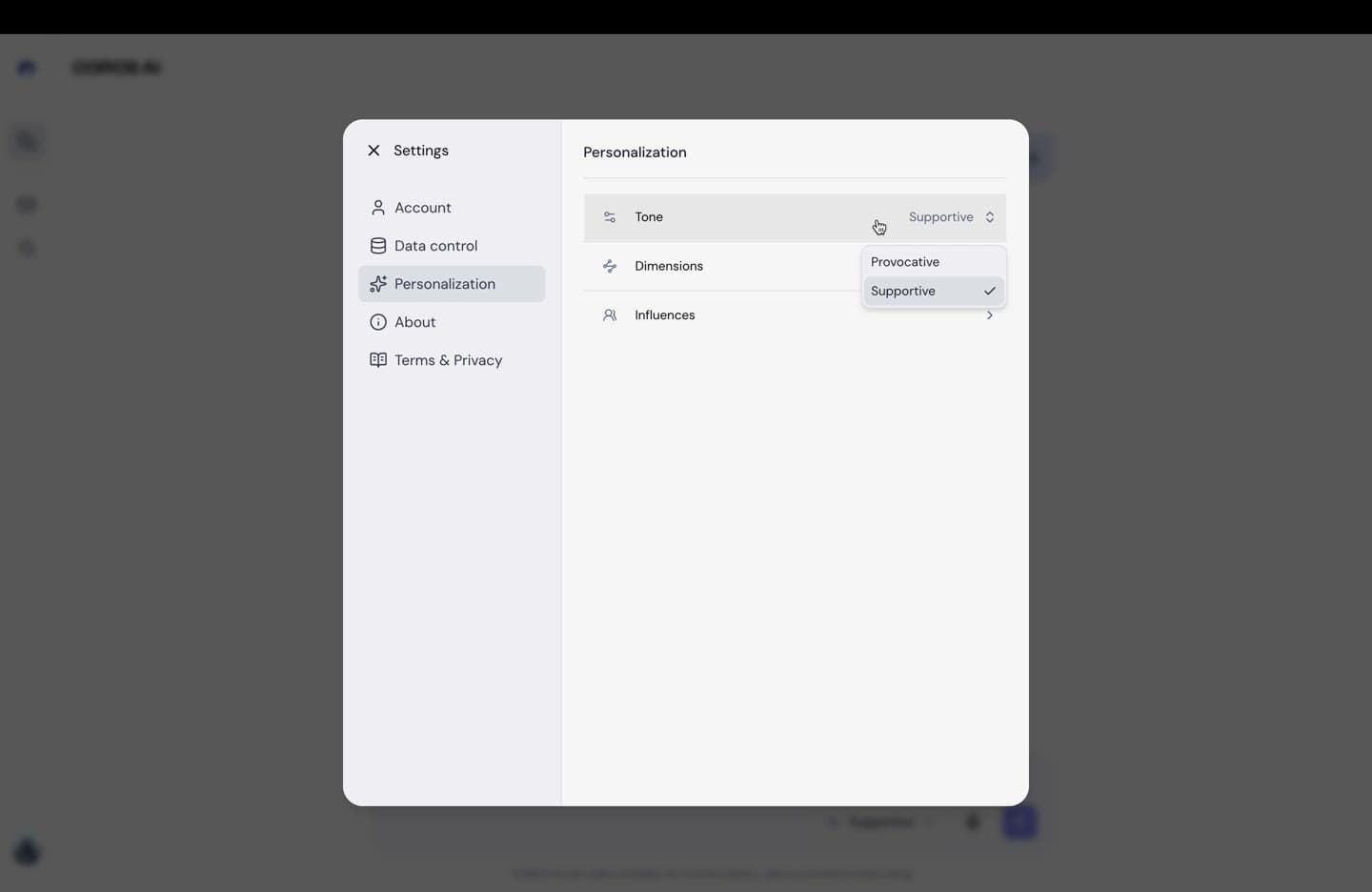
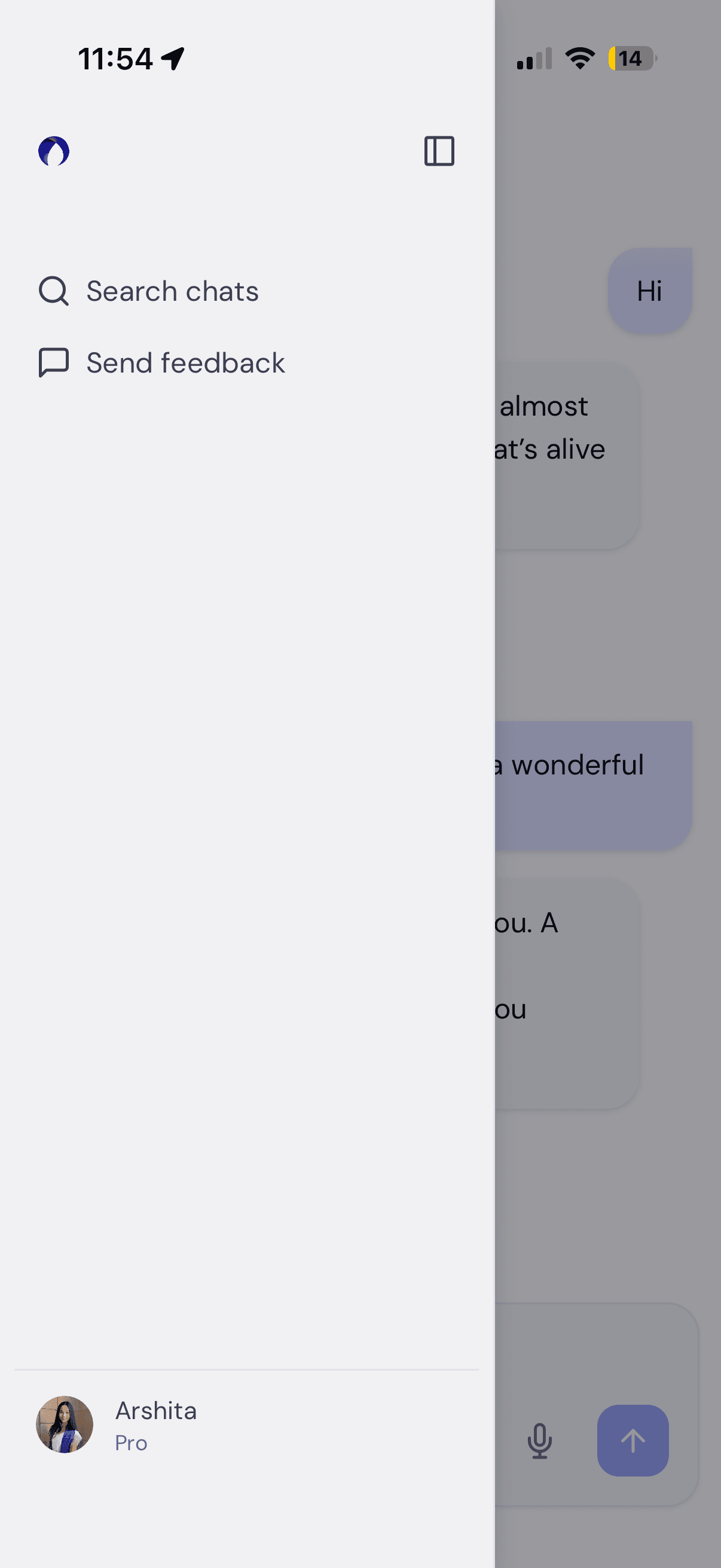
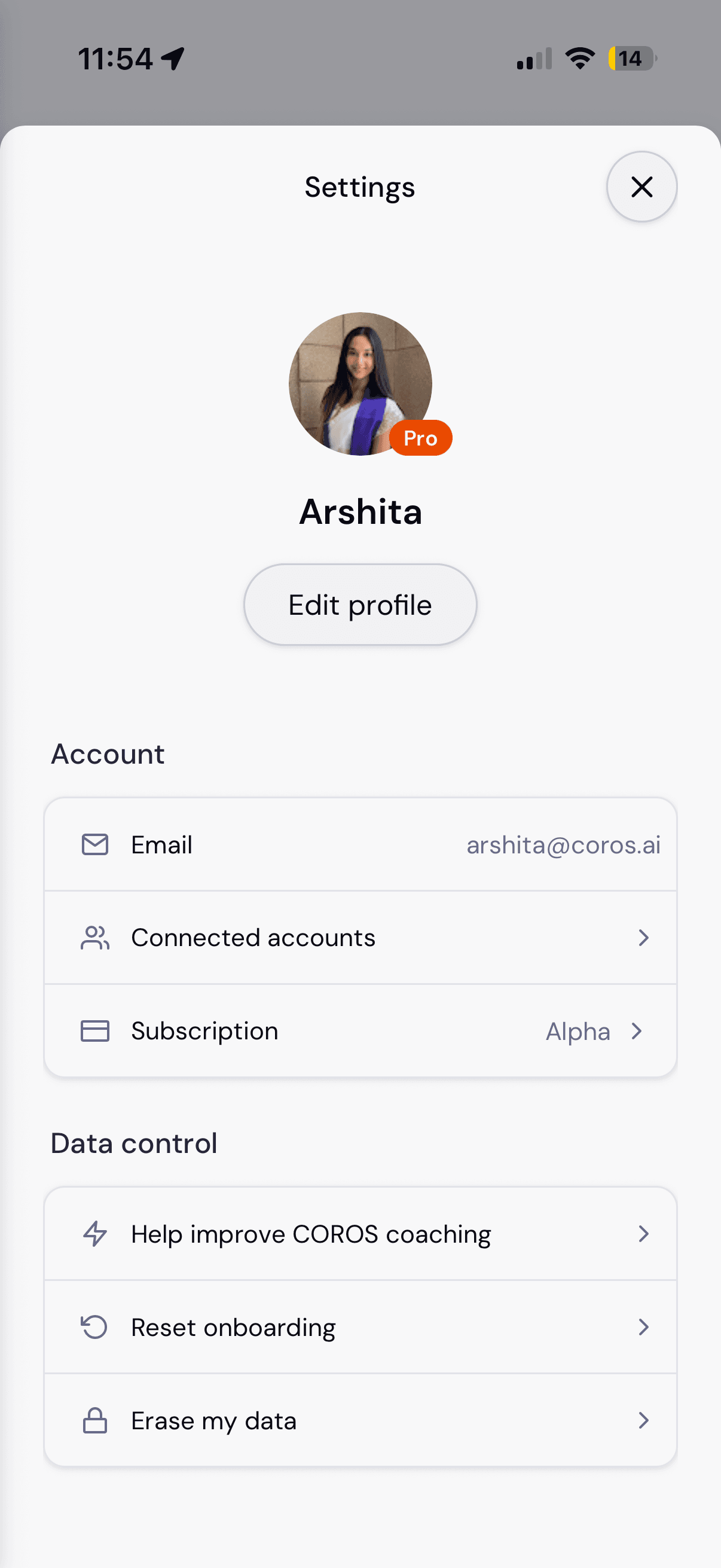
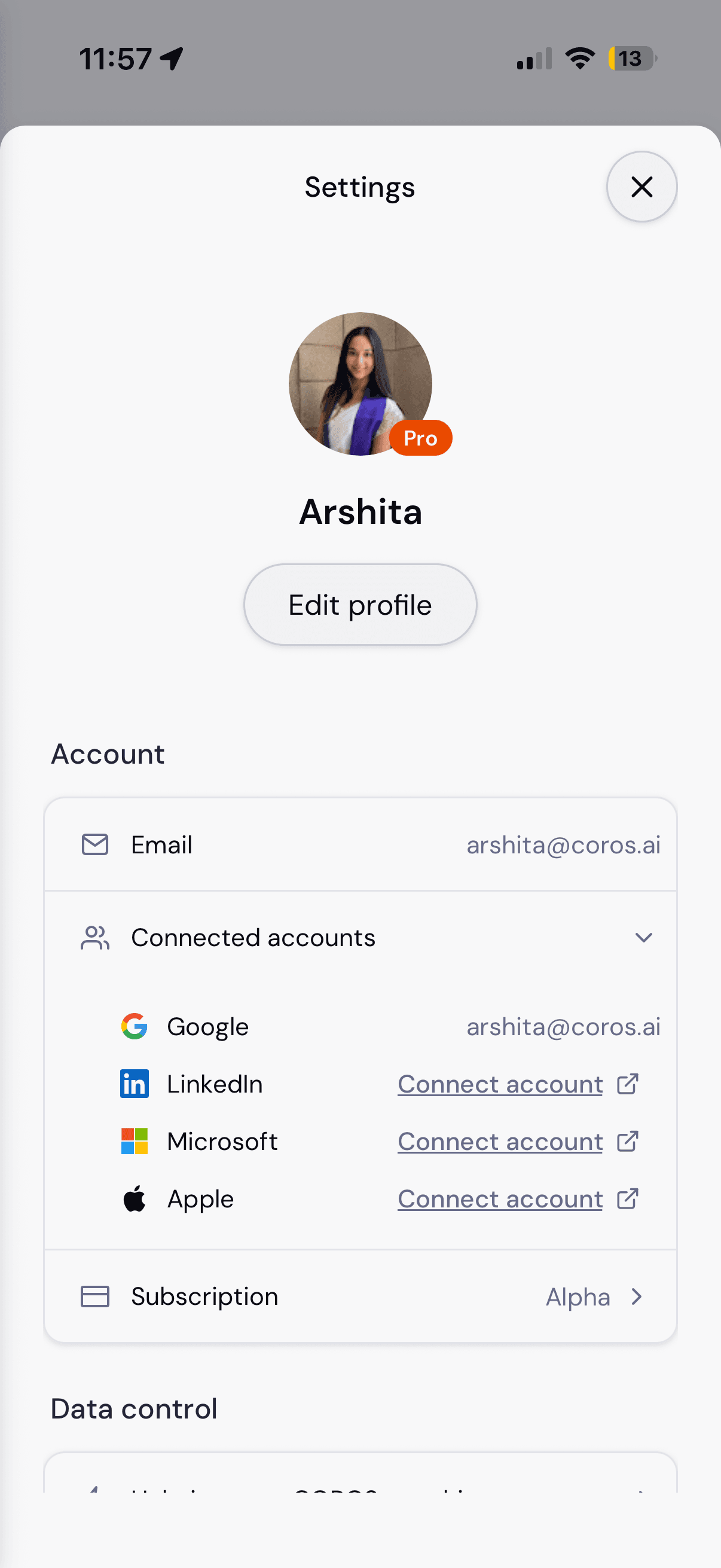
The settings shell on mobile: the sidebar flyout, the profile and Account group, and Connected accounts expanding inline rather than pushing to a new screen.
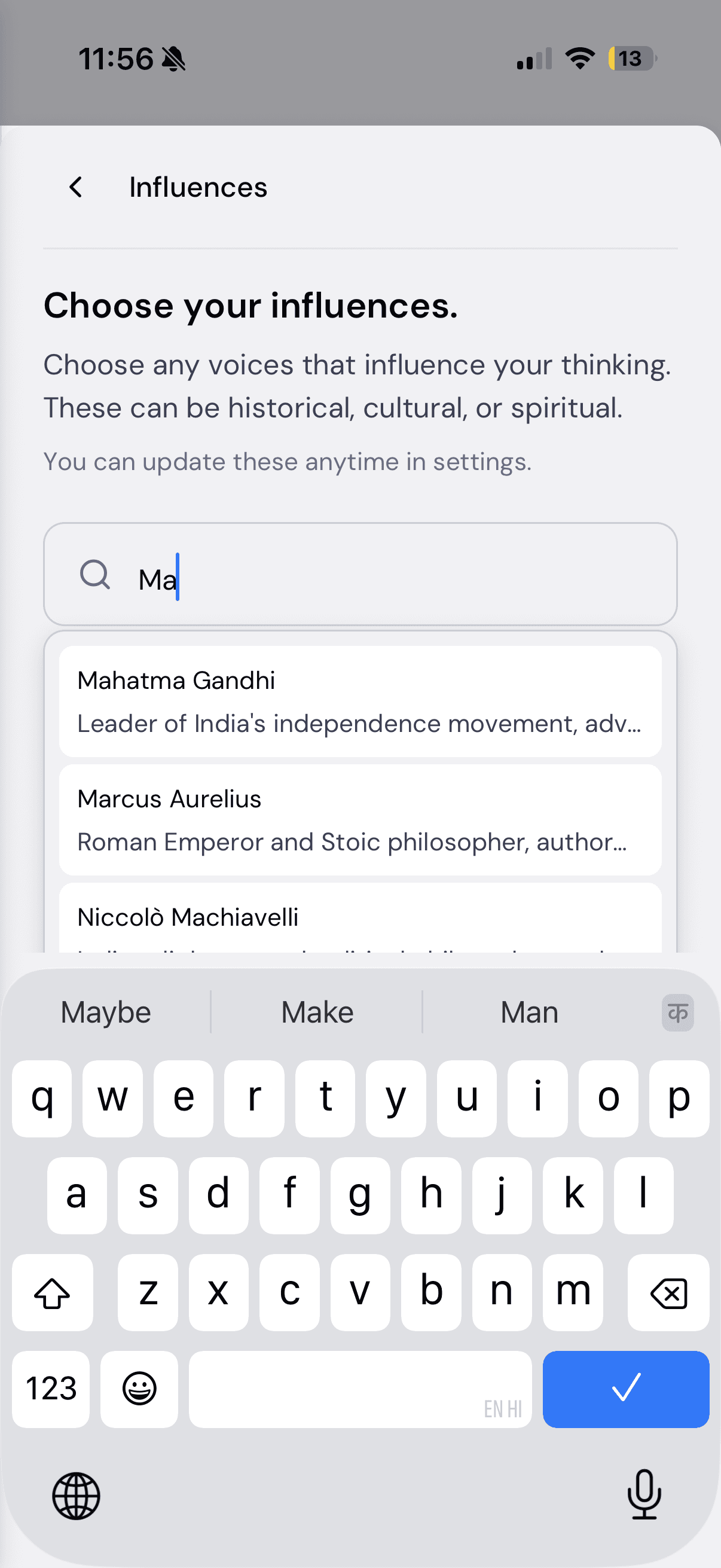
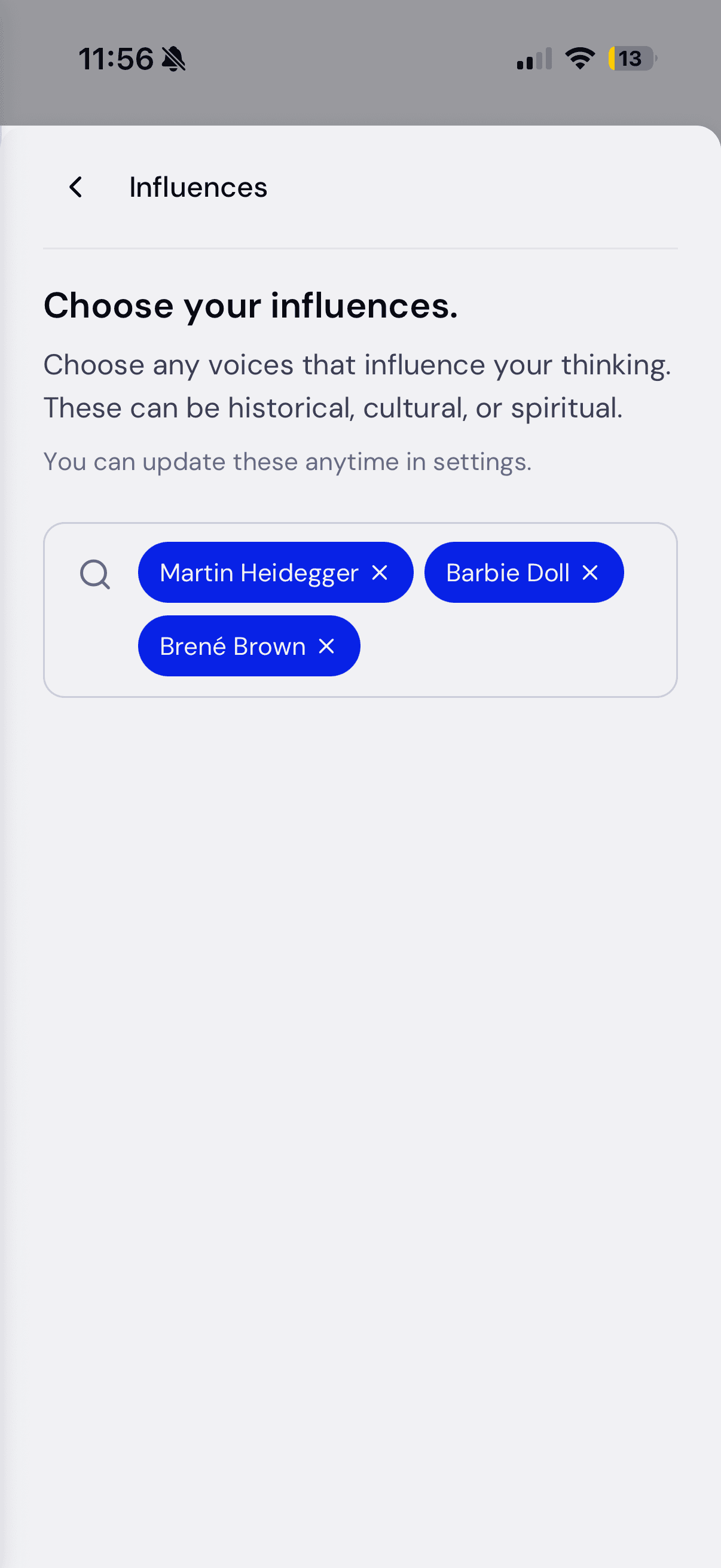
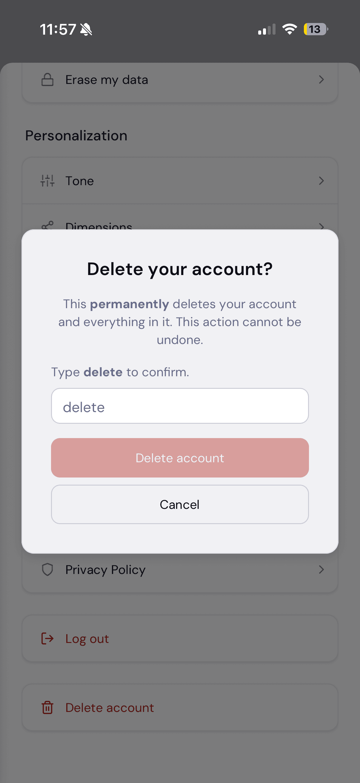
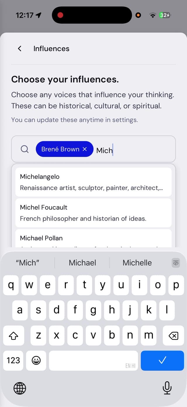
States, not just screens: searching influences, the selected chips, and the type-to-confirm delete dialog on its own destructive token.
Feature
Retrieved Context panel (team-only)
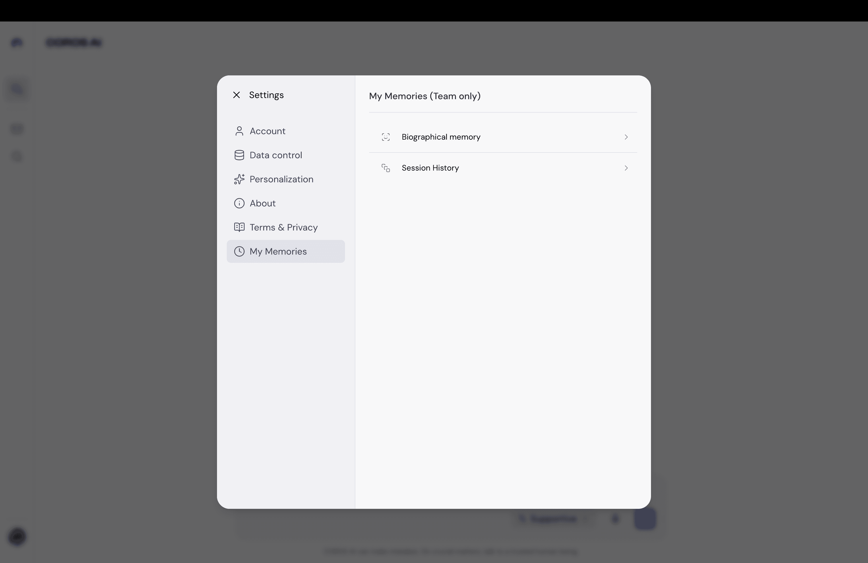
My favorite piece. Debugging the AI meant engineers digging through logs. I designed an in-product panel that shows exactly what the model saw for any response:
When a response lands wrong, the first thing to establish is whether the system knew which conversation it was in. The new-topic-versus-continuation field answers that directly. A correct answer to the wrong topic still reads to the user as a broken conversation.
- Retrieved sessions with semantic and recency scores.
- Session-boundary probability.
- Chunk results.
- Memory.
I did prompt QA myself, so I designed it as my own user. Every field answers a question I actually had.
One system, two voices
User
I feel like I'm working overtime every single day, but my team just keeps giving me grunt work and I'm so pissed off.
Supportive
I hear you. How are you doing as you bring this up? What's happening at work?
Provocative
Are you going to do it or not?
Tone selection swaps the whole response architecture, not a word bank, which is why one response asks for more context and the other asks for a decision. The inline tone quick-switch shown above lets a user change it mid-conversation.
Impact
Results
- Live in production on 4 platforms at app.coros.ai.
- Zero redesign requests on documented handoff specs.
- A library the whole team ships from.