COROS AI · Case Study
Rebuilding the design system across three platforms
Product Design · Design Systems · Design Engineering. Migrating a live AI coaching product onto a scalable design system across four platforms.
- Role
- Product Designer · Design system ownership · Surface design · Developer handoff
- Team
- Founder/CEO · 2 engineers · 1 designer
- Platforms
- Web (desktop + tablet), iOS, Android
- Links
- Live product · Figma system
Summary
TL;DR
COROS AI’s first product ran on stock Material UI: dark-only, desktop-only, and hard to iterate on. I led the full redesign onto a shadcn foundation, building the design system from raw color primitives up to a published Figma library with 54+ semantic tokens, full light/dark theming, and responsive components across four platforms. I redesigned every base surface (onboarding, chat, sidebar, and settings) and designed an internal “Retrieved Context” panel that lets the team inspect the RAG pipeline directly inside the product.
The redesign is live in production. The onboarding rework contributed to a 2.5× increase in user return rate, and the shared token system cut design-to-review cycles from days to hours.
2.5×
increase in user return rate after the onboarding rework
54+
semantic tokens, themed for light and dark in one file
4
platforms from one system: web desktop, tablet, iOS, and Android
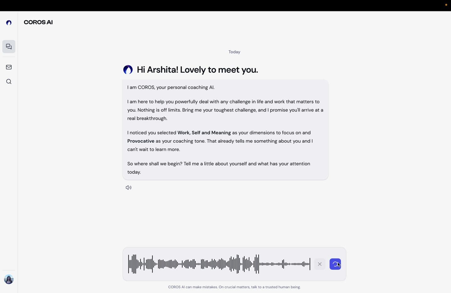
The redesign, at a glance
Context
Why the redesign happened
COROS is an AI coach. The interface has one job: stay out of the way of a deep, sometimes emotionally heavy conversation while still feeling premium. The MUI product did the opposite. Testers said the dim, low-contrast dark theme strained their eyes during long sessions, and there was no light mode to offer them.
The internal problems were structural. MUI defaults were overridden ad hoc with no token layer, so restyling anything meant touching individual components. The UI was desktop-only despite mobile plans. With a second designer joining and engineers building from screenshots, there was no shared library or naming convention, and the brand (COROS blue #0822E6, orange #EA4A00) had disappeared into Material defaults.
Engineering was moving to shadcn/Tailwind. My mandate was to build the design side of that migration and redesign every surface on top of it.
Design system
Three layers, zero shortcuts
I built on the Obra shadcn Figma kit because it mirrors how shadcn works in code: components only reference semantic tokens, never raw values. I extended it with a strict architecture.
Raw primitives → Brand layer → Semantic tokens → Components
For primitives, I generated full 11-stop scales for new coros-neutral, coros-blue, and coros-orange groups, with the brand hexes locked at the 600 stop. The neutrals aren’t gray; they’re tinted at the brand’s blue hue, so even “empty” surfaces feel like COROS. I also built a custom crimson scale for destructive states when the kit’s red clashed. Everything was added as new groups instead of overwriting kit defaults, keeping the kit upgradeable.
Semantic tokens are forbidden from touching raw scales directly; they resolve only through the brand layer. That one rule makes a rebrand a single-layer repoint instead of a token audit. On top sit 54+ role-based tokens mapped for light and dark via Figma variable modes, including product-specific tokens like chat-bubble-coros and chat-bubble-user that shadcn doesn’t ship.
The payoff: every screen is designed once. Toggling the frame’s mode re-resolves every token, so verifying both themes is a click, not a redraw. That is the only way a team this small ships two themes across four platforms. I published the library for the whole team to build on.
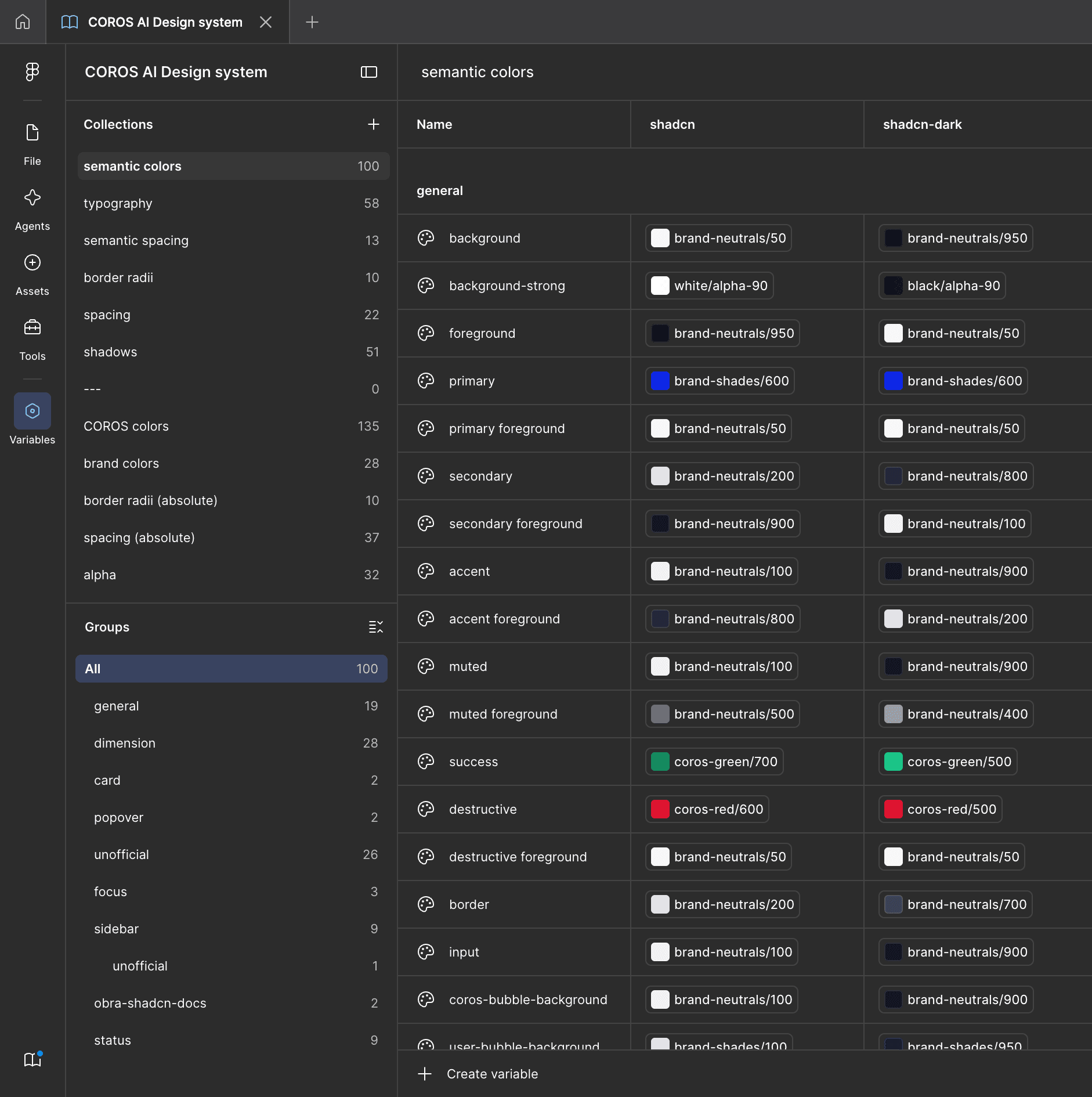
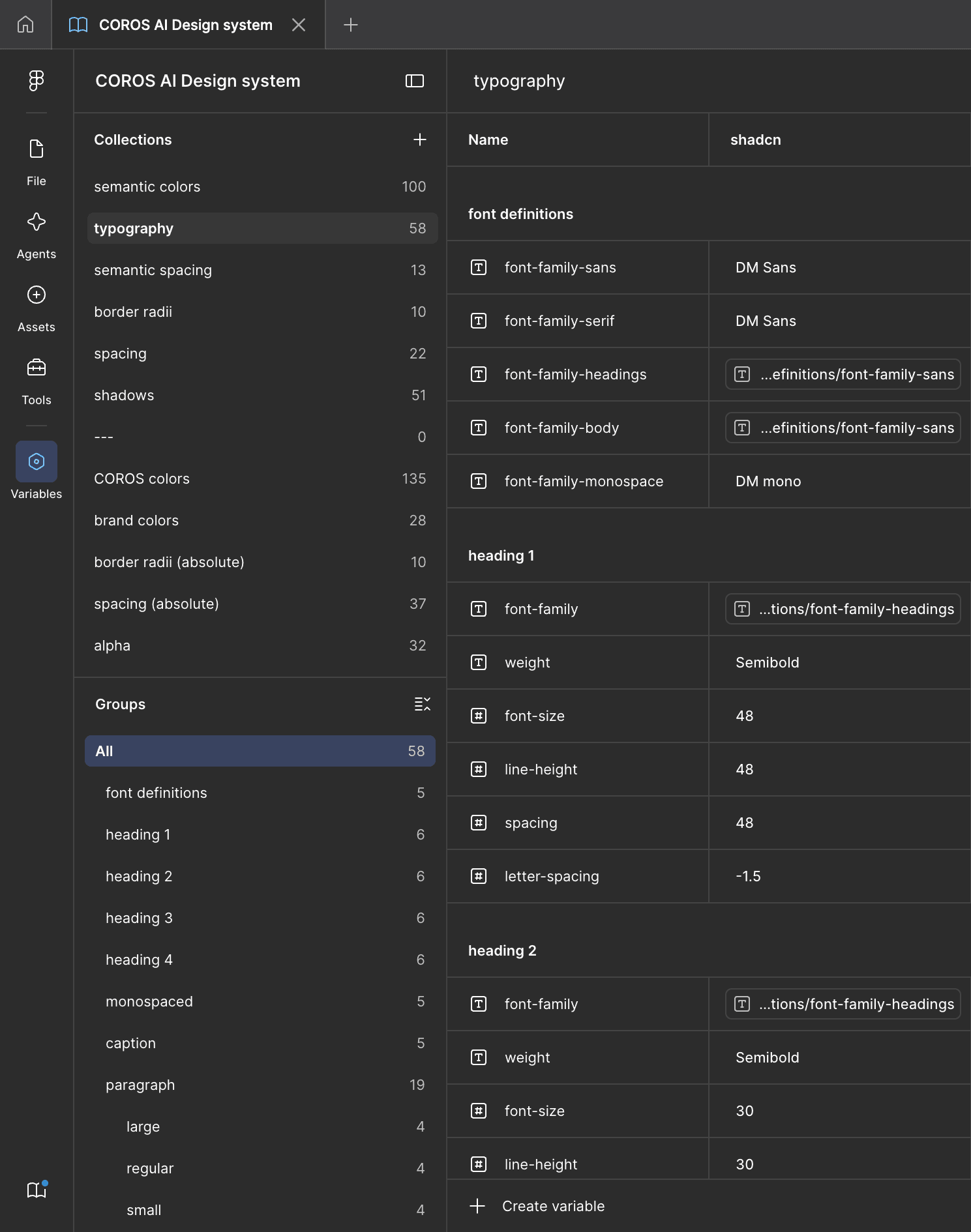
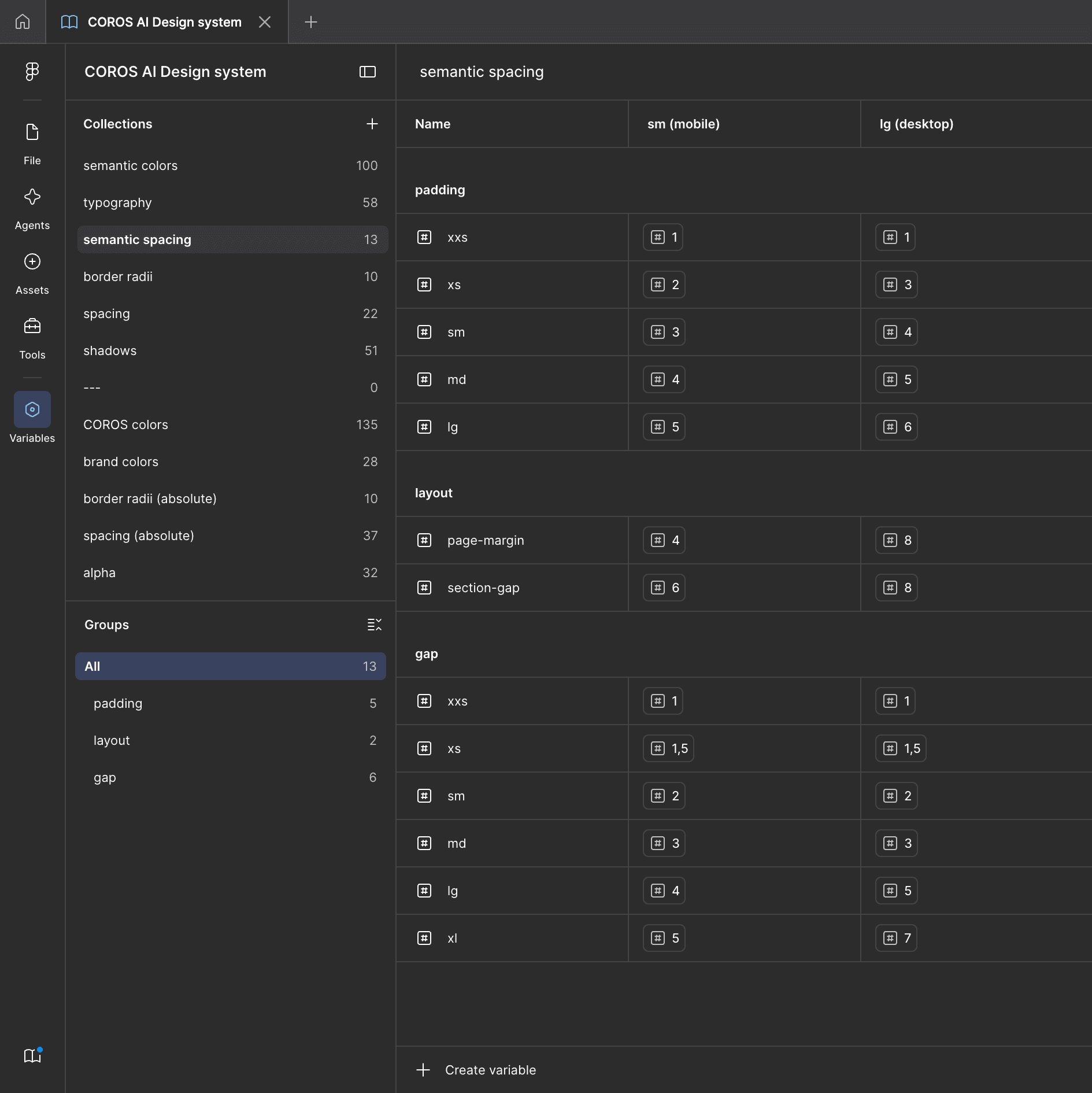
The variable library at a glance: semantic colors holding a value per token for both the shadcn (light) and shadcn-dark modes, typography resolving through shared font definitions, and spacing carrying separate sm (mobile) and lg (desktop) values. Every color resolves through a brand reference, never a raw hex.
Component architecture
How the components were built
My rule: variants only when structure changes, component properties for everything else. The chat input bar shows why: it needed default, focused, with-text, and multiline states across breakpoints, which naively explodes into a variant grid. Instead:
- Multiline earned a variant: it changes the component’s height and layout.
- Focus became a boolean: it’s just a ring, not a new structure.
- Send button and placeholder became component properties.
- Width differences were handled by auto-layout constraints rather than breakpoint variants, so the component resizes instead of multiplying.
The same logic ran through message bubbles, the sidebar, and settings. Icons standardized on Lucide at 20px inside 32px ghost hit areas, benchmarked against production values from leading AI chat products rather than invented.
Screens
Redesigning the core screens
Chat
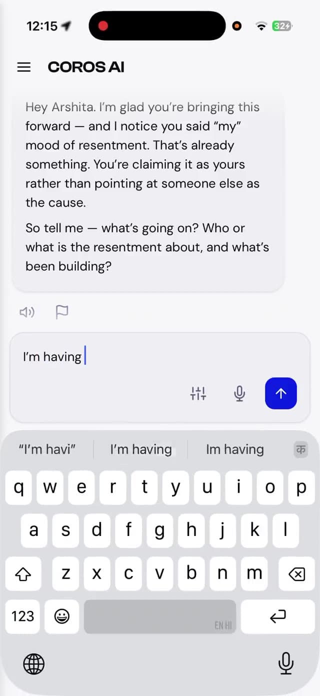
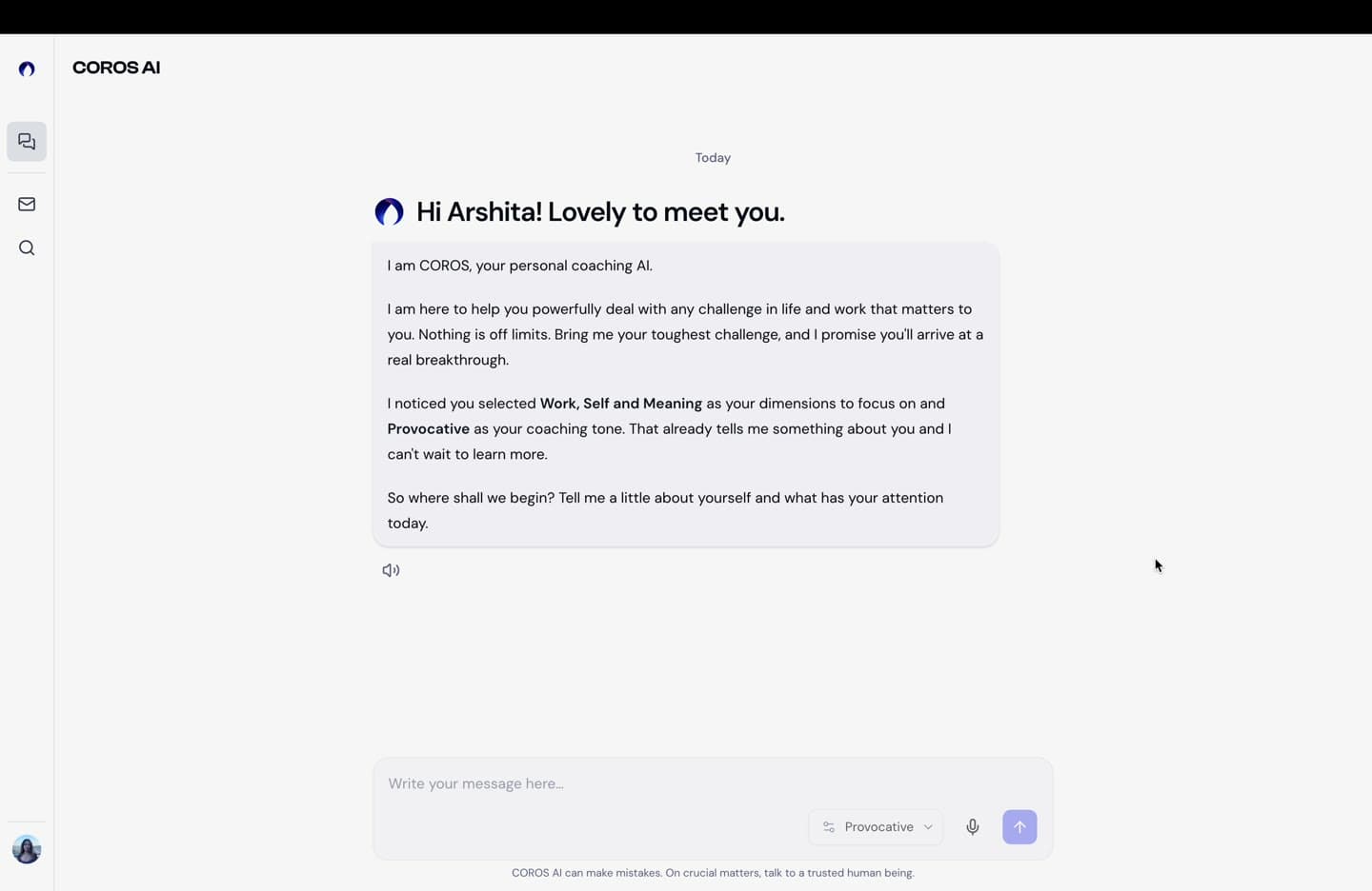
Chat is the product, so it got the deepest state inventory: empty state, typing indicator vs. streaming text, errors and retries, message-level actions, and scroll and return-to-chat behavior. The user bubble color was a real debate: full brand blue felt heavy, so I prototyped three alternatives in working HTML across both themes and brought the finalists to stakeholder review. That set the project’s working pattern: prototype disagreements, don’t argue them.
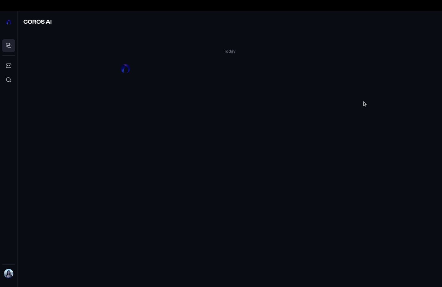
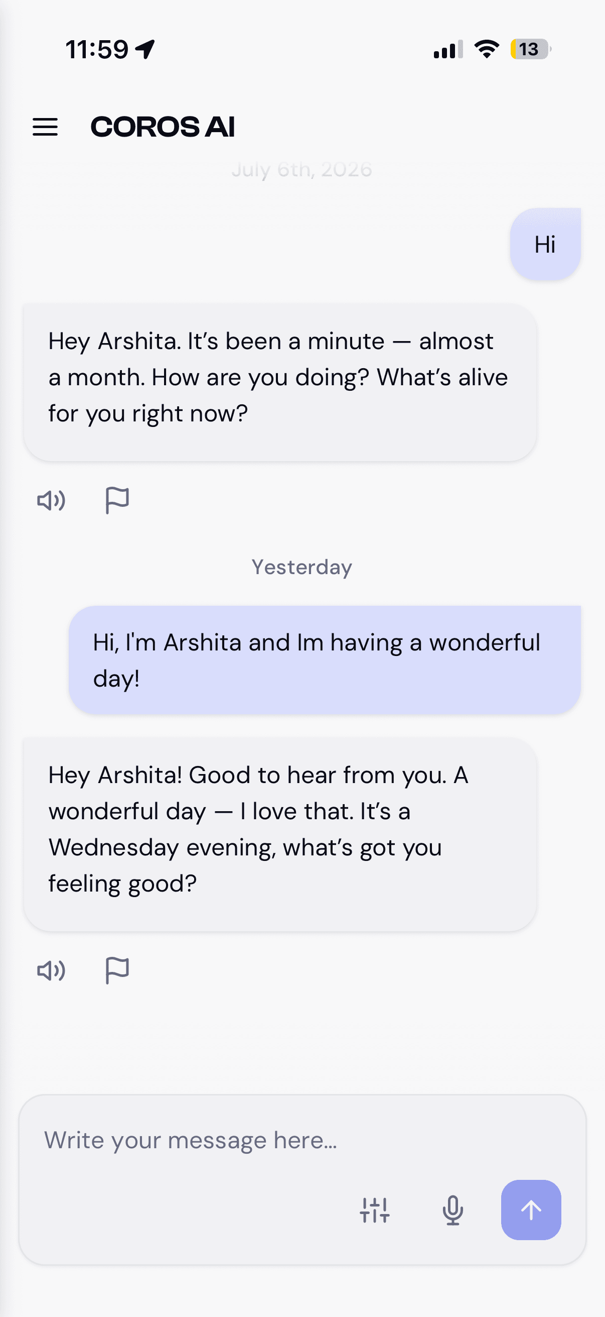
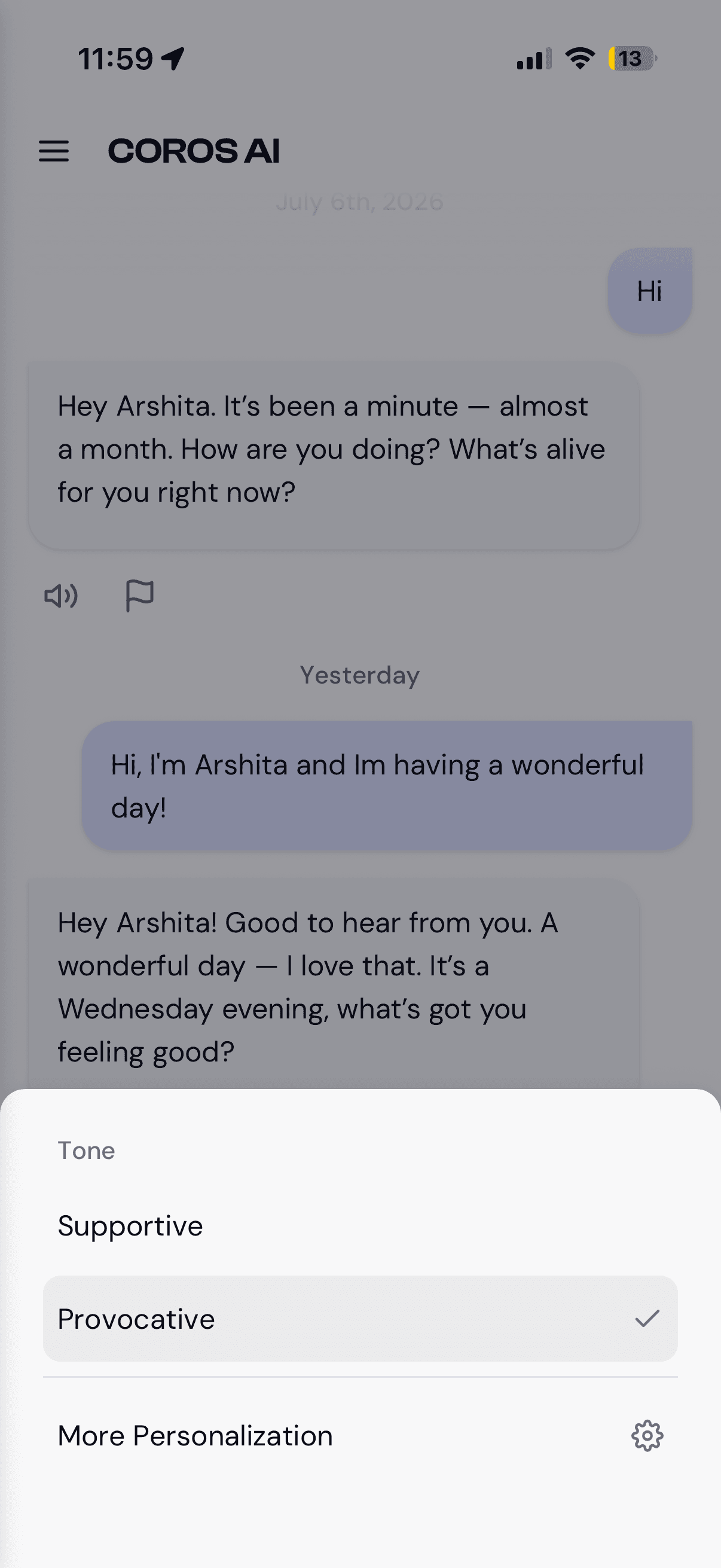
The same surface on mobile (light theme): date-grouped history with message actions, the inline tone quick-switch, and composing a message: one component system, both themes.
Onboarding
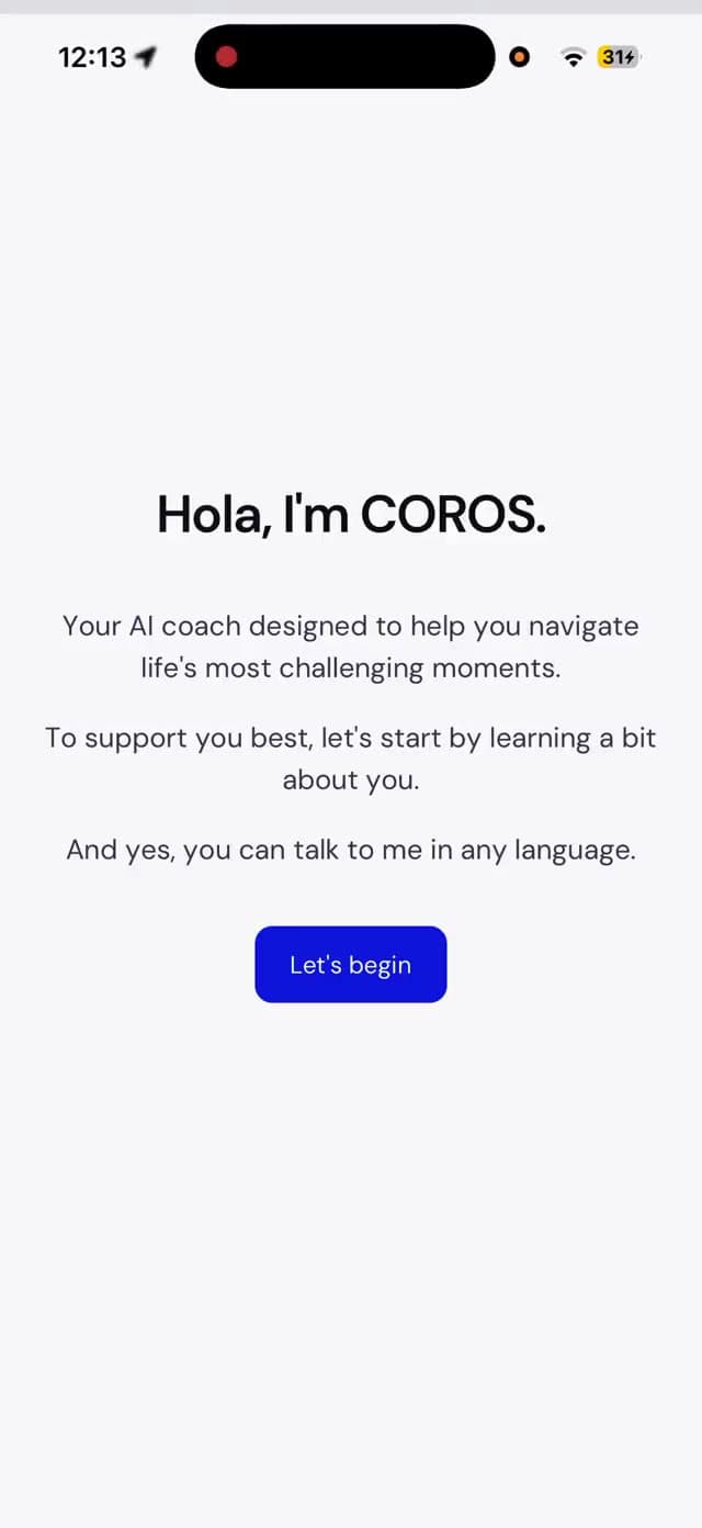
The legacy flow was eight dark-only screens that asked for the user’s name last, after personalizing everything. I restructured it to six: Welcome → Name → Dimensions → Influences → Tone → Loading, with the name up front so the rest of the flow can address the user personally. The welcome greeting rotates through nine languages to signal multilingual support without a selector. The tone screen teaches through interaction: the chosen card comes forward, the background tints blue or orange, and each orb animates to match its personality. Every screen shipped for all four platforms.
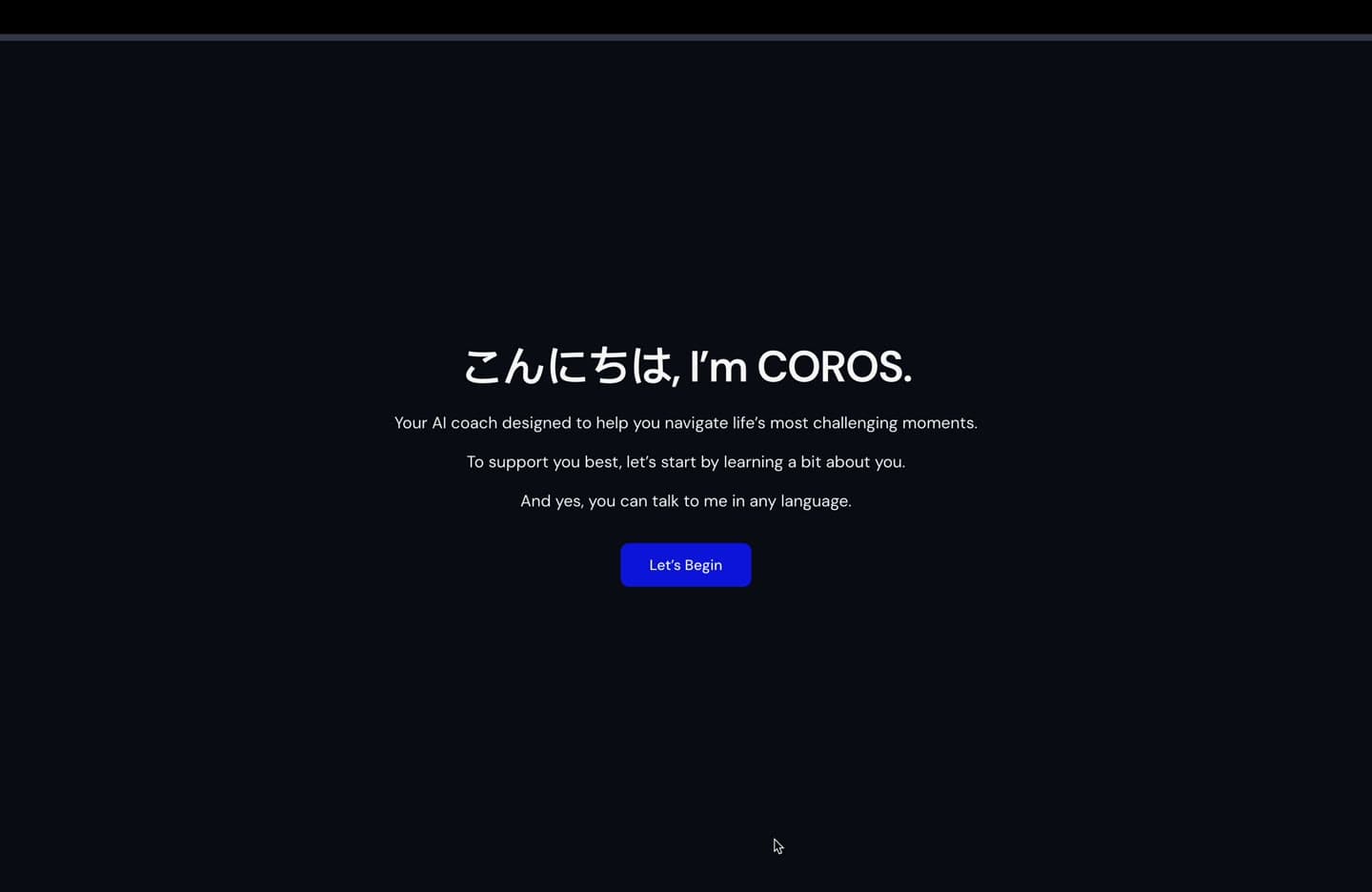
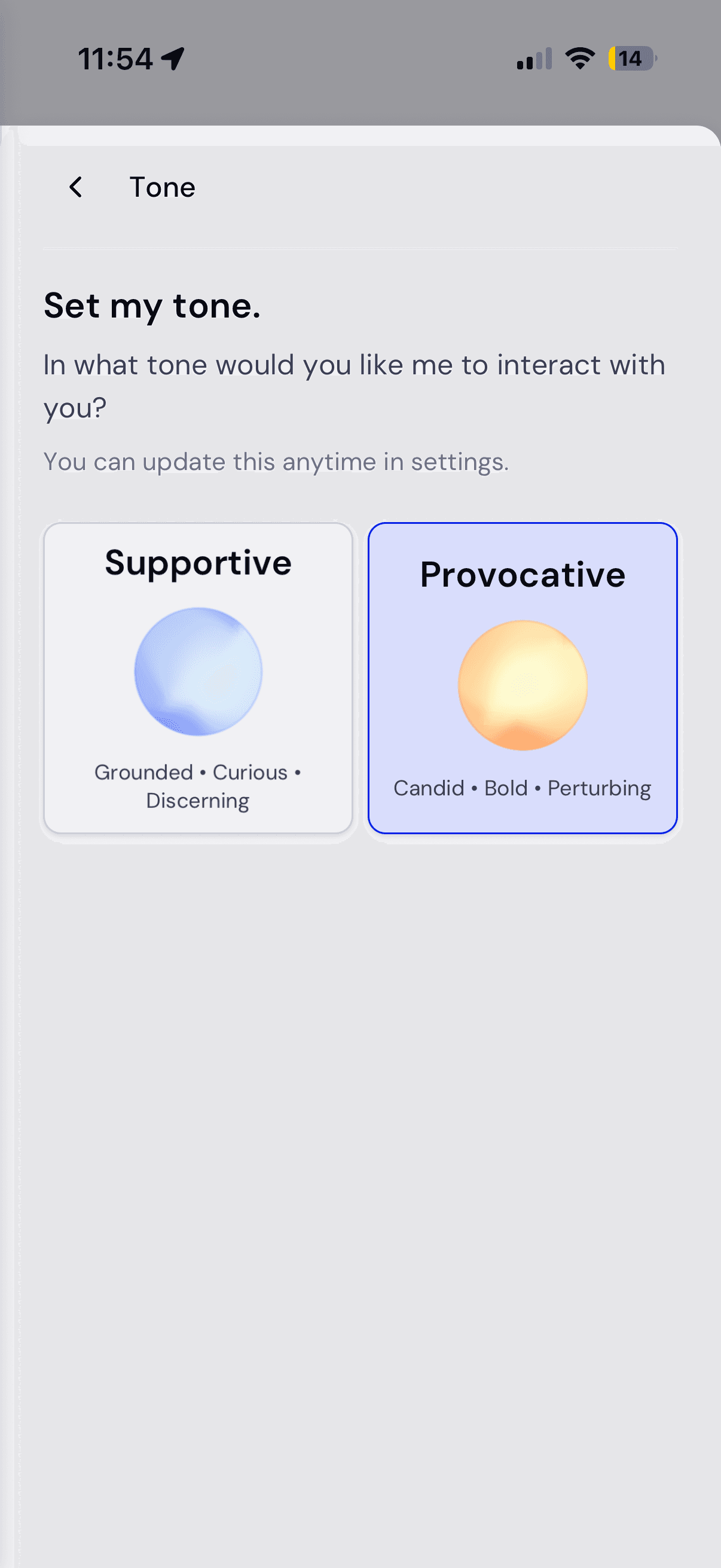
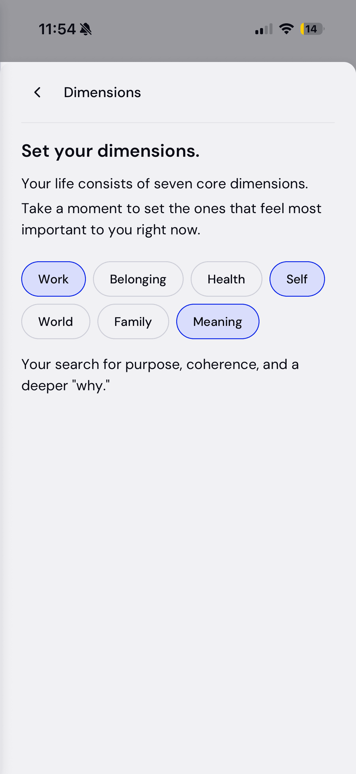
The same flow on mobile (light theme): the multilingual welcome, tone cards, and dimension pills. Every screen was designed for web desktop, web tablet, iOS, and Android at once, so the token system is what keeps them identical.
Sidebar & settings
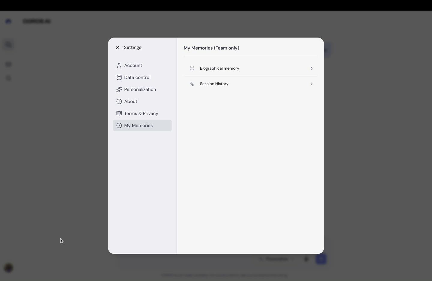
Settings became a modal shell with a persistent left nav (Account, Data control, Personalization, About, Terms, and My Memories) consistent across every tab so the frame never jumps. The Appearance toggle moved out of settings and into the sidebar as an inline utility row, since switching themes should never require navigating anywhere.
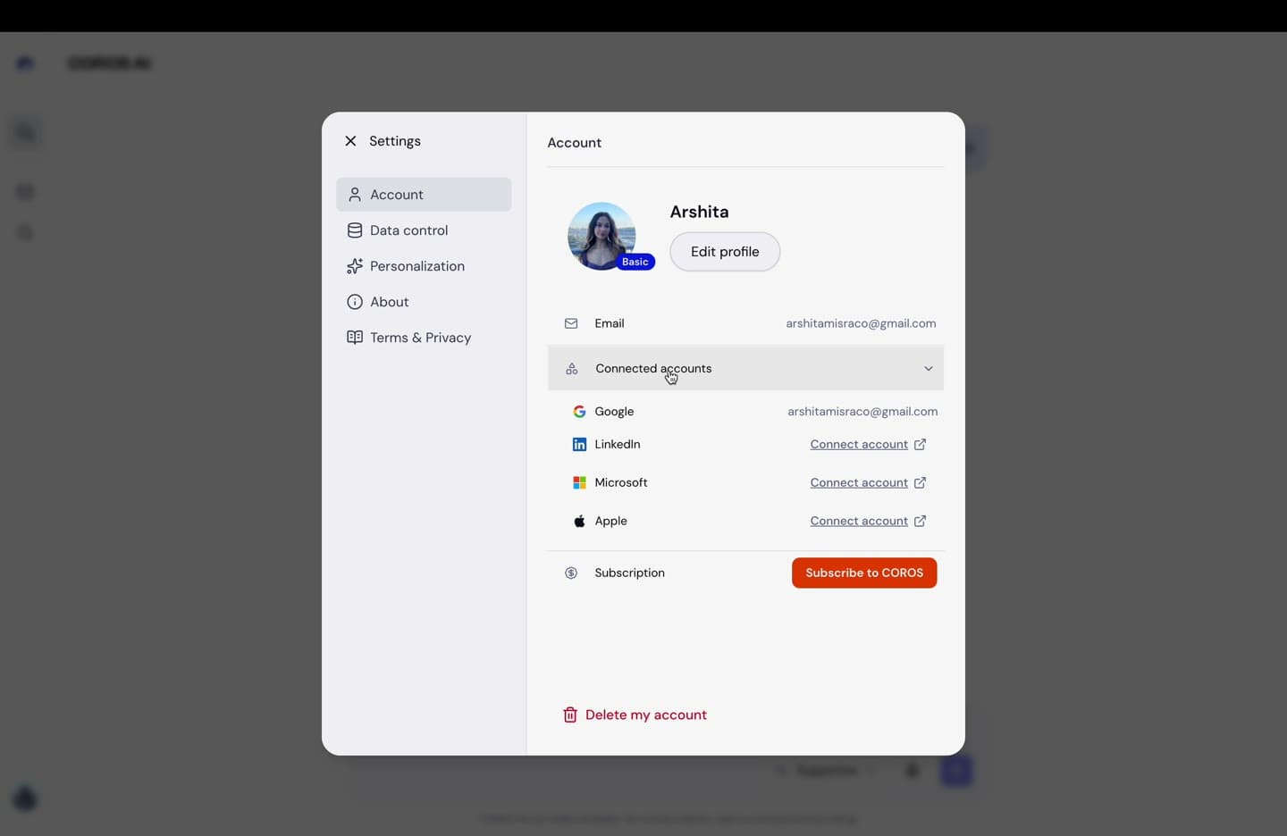
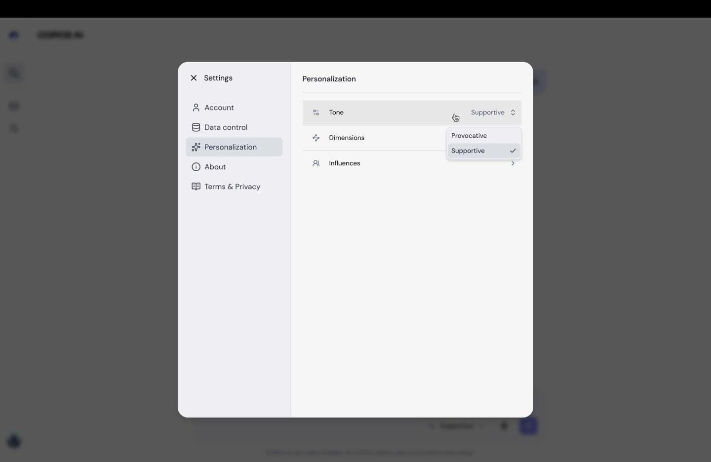
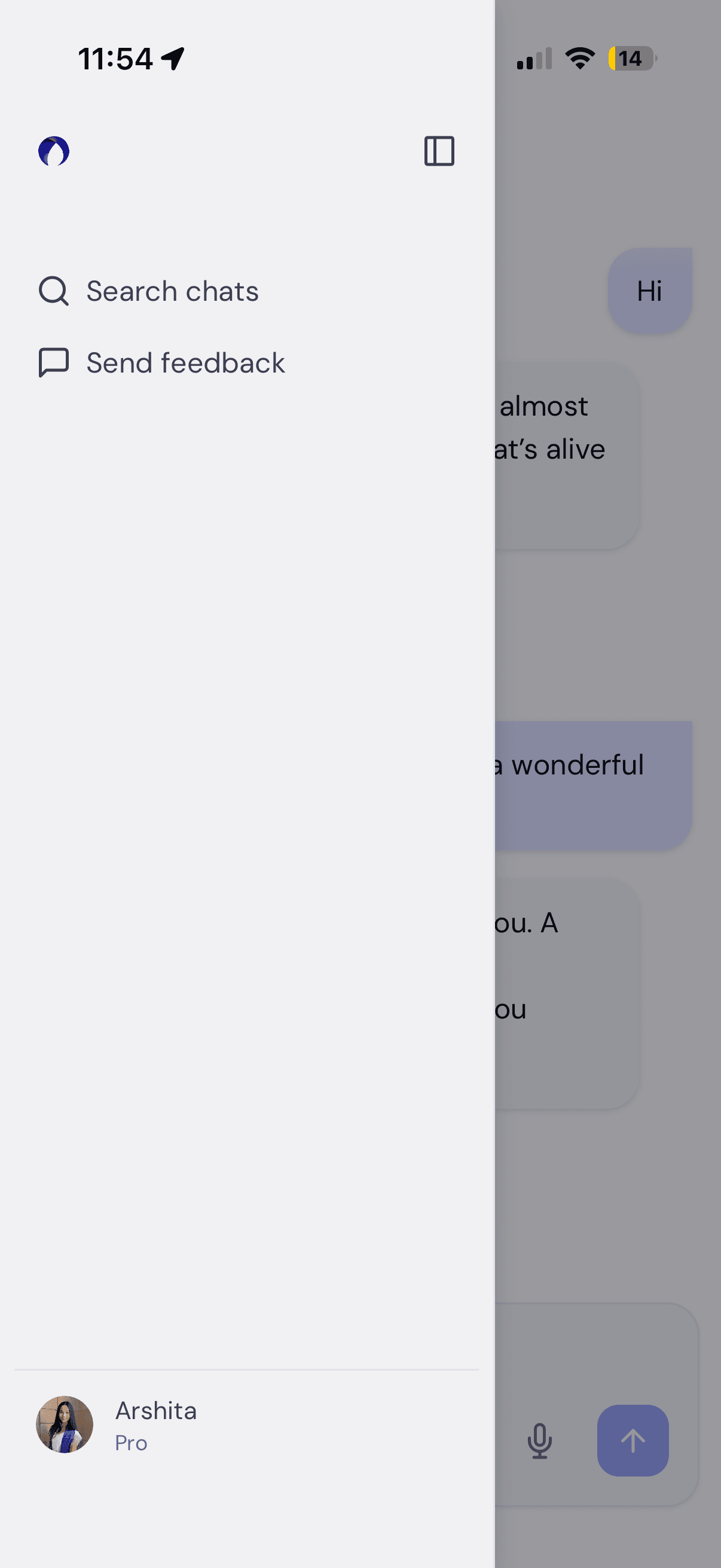
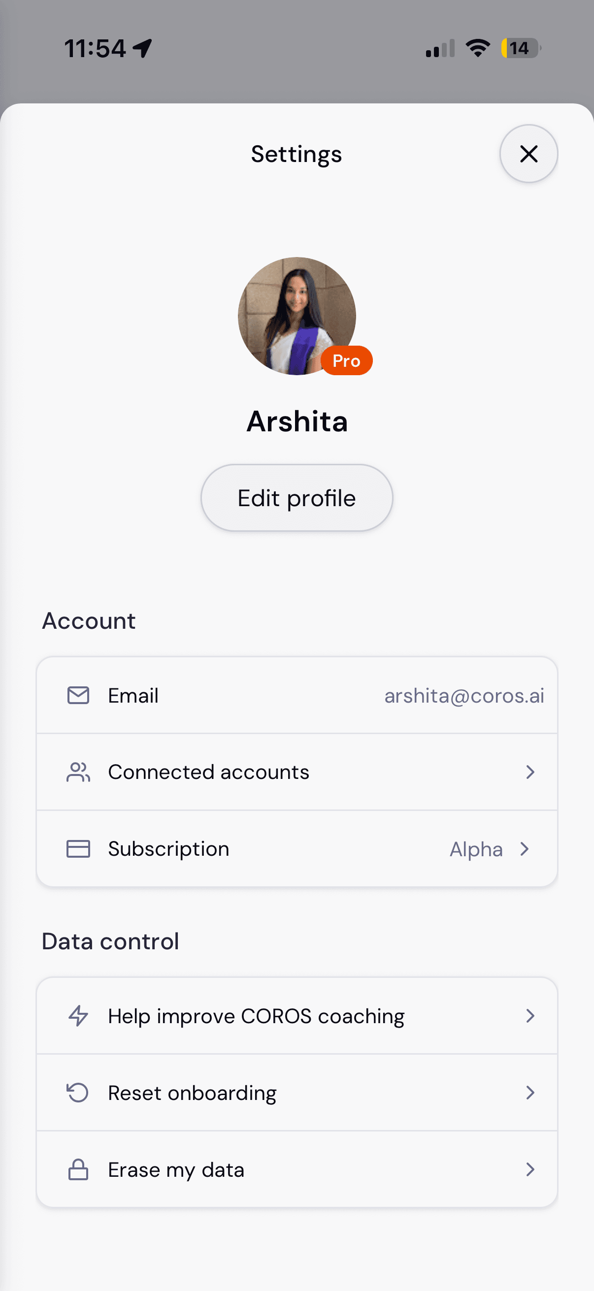
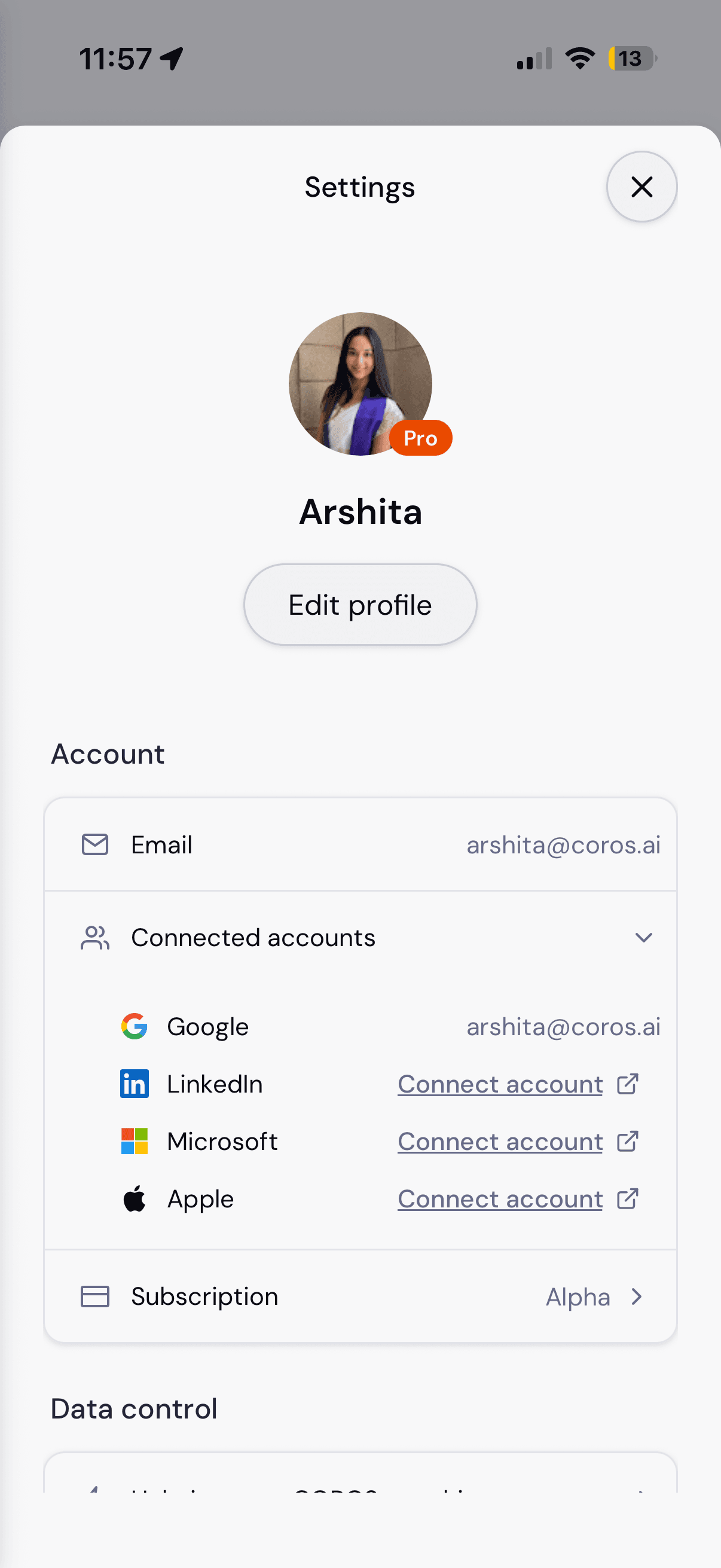
The settings shell on mobile: the sidebar flyout, the profile and Account group, and Connected accounts expanding inline rather than pushing to a new screen.
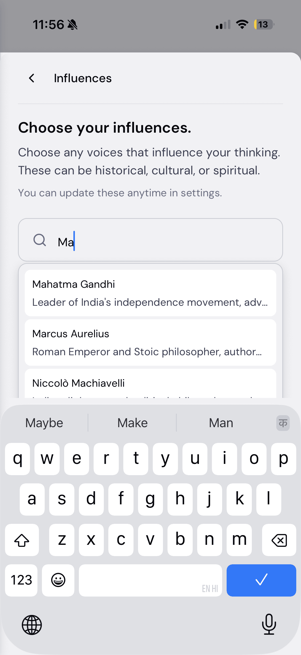
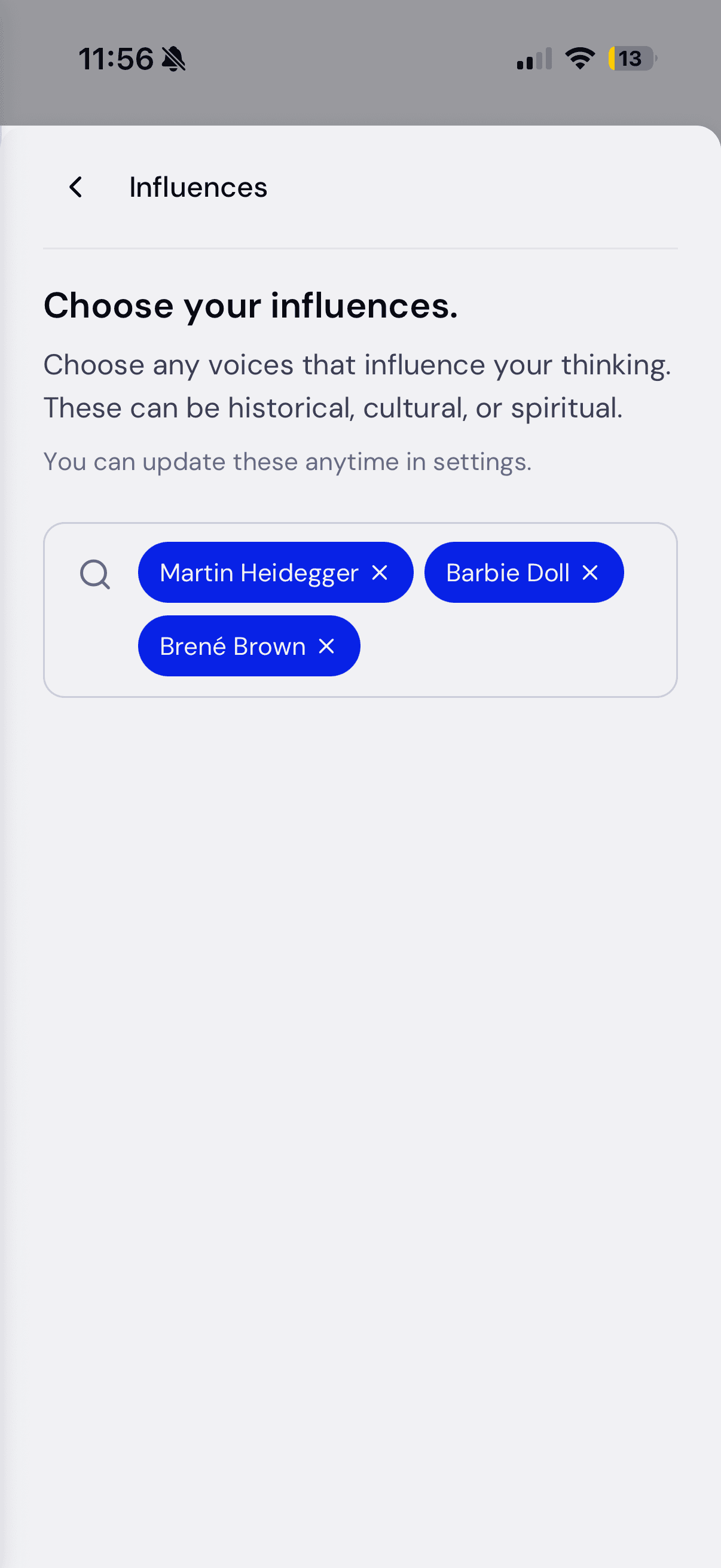
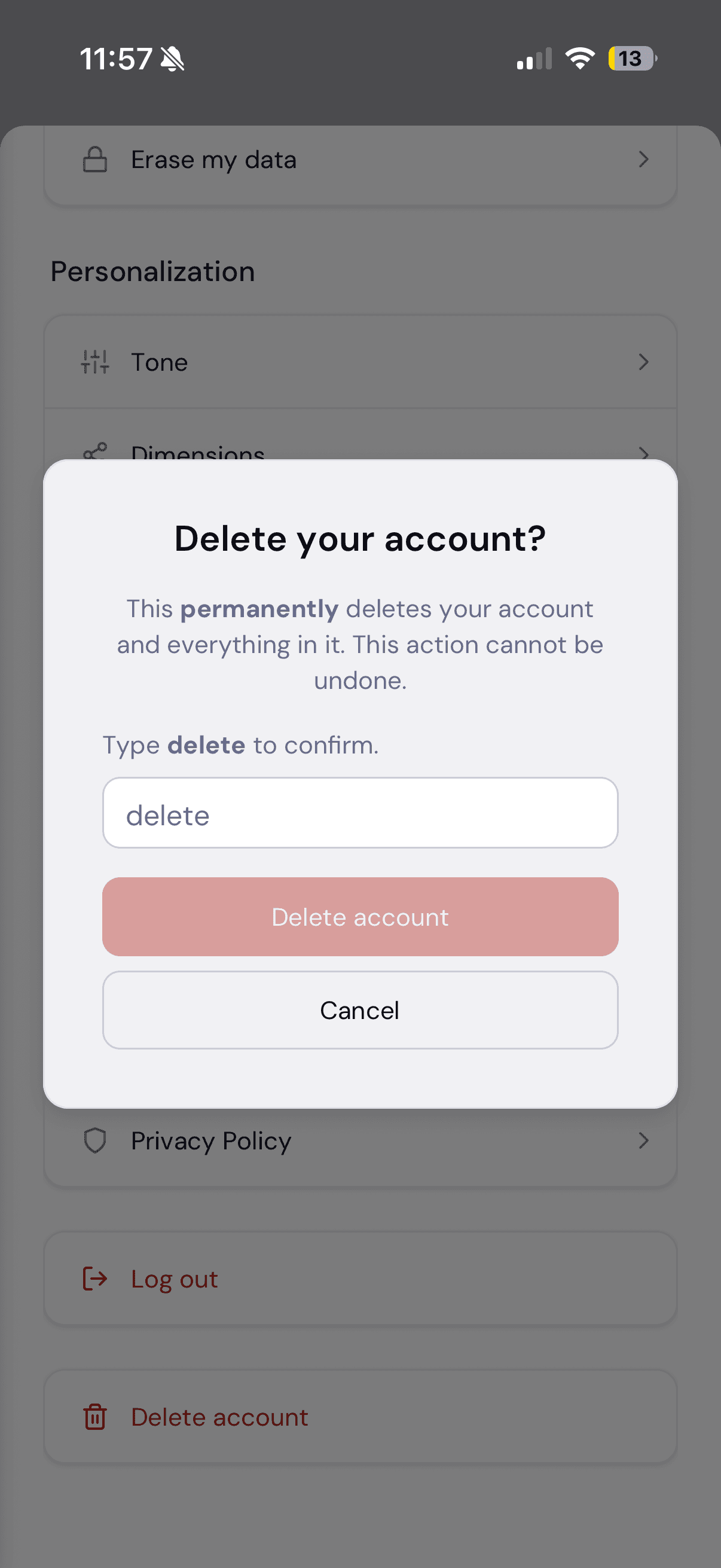
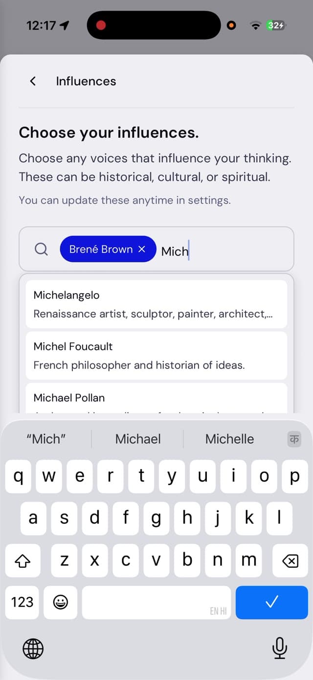
States, not just screens: searching influences, the selected chips, and the type-to-confirm delete dialog rendered on its own destructive token.
Feature
A debug panel for the team, built into the product
COROS’s coaching quality depends on a retrieval-and-memory pipeline: the model pulls in relevant past context before it responds. When a response went wrong, answering “what did the model actually see?” meant an engineer digging through logs.
I designed a team-only panel, opened from any COROS response, that exposes the pipeline for that exact turn:
- The query and response pair under inspection, so the debugging session is anchored to a concrete exchange.
- Whether the model treated this as a new topic or a continuation of an earlier one.
- The short-term memory, turn by turn.
- The past context it retrieved, ranked by how relevant each piece was to the moment.
- The longer-term memory as the model sees it.
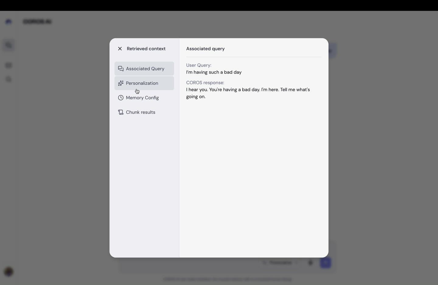
I was doing the prompt QA myself, so I designed the tool as its own primary user: every field answers a question I actually had during prompt iteration: “did it treat this as a new topic when it should have?” and “why did it pull in that past session?” It uses the same tokens and modal shell as settings, so it reads as a native surface, not a bolted-on debug console.
The feature quietly changed how the team works: prompt regressions that used to be argued from vibes are now diagnosed from the panel.
Impact
Handoff & outcomes
Designs shipped with a markdown spec per surface (layout differences, component inventory, UX states, and edge cases) written to a consistent template so engineers always knew where to look. Documented sections were accepted by engineering with zero redesign requests.
Results:
- Live in production at app.coros.ai across web, iOS, and Android.
- A 2.5× increase in user return rate after launch, with the onboarding rework as a primary contributor.
- A published library the whole team builds on: the second designer and both engineers work from the same tokens, without detaching components.
- Review cycles cut from days to hours, aided by working HTML prototypes for contested decisions.
Reflection
What I learned
Token discipline is a social contract, not a Figma feature. It only holds if someone enforces it in review: the system’s value came from the discipline, not the variables.
Design the boring layer first. Weeks spent on color architecture before drawing a single screen felt slow at a pre-seed startup, and it turned out to be the highest-leverage decision of the project: every surface after it was faster than the one before.
Internal users deserve product design too. The debug panel could have been a JSON dump; treating the team as real users produced a tool people actually open, and it made me a better prompt engineer, because I had to decide what information mattered.